The Visual Perception of Information
-
 Moe Hachem
- January 31, 2021

It’s crucial to understand how we, as humans, perceive and absorb the information in the world around us. Without a proper understanding of how we perceive information, it becomes hard, if not impossible, to design meaningful user experiences.
How do we perceive the world?
We perceive the world through our senses, such as touch, smell, taste, sound, and sight. We’ll focus on the visual perception of information in this article because we mostly receive information visually. That is especially true when we are talking about graphical user interfaces (GUI).
I’ll explain how visual perception works, and then look at how we can leverage that understanding.
How do we perceive?
For most people without visual impairment, we tend to have a specific field of vision.

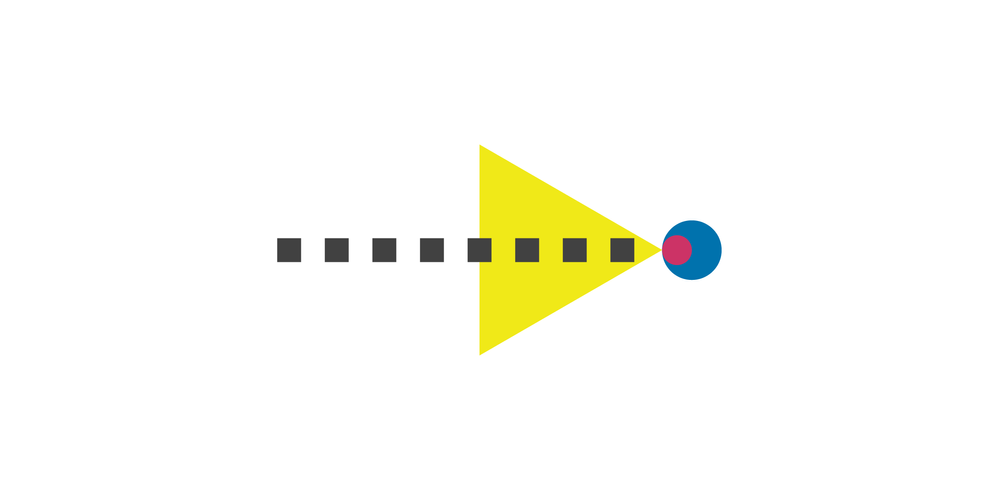
In the centre lies what’s called central vision. Our “central vision” is limited and has a range of 5 degrees. This field is where we pick up detailed information, read a text, recognize faces, and so on.
As you go further out from the centre, you’ll find what’s called peripheral vision. Our peripheral vision doesn’t typically get any detailed information. For most parts, you’ll only be able to perceive how light or dark an area is, but you won’t be able to read or recognize things through your periphery.
Give it a shot, try and read this article using your periphery only, it’ll be hard if not impossible.
Scanning Information
How do we pick up information on more complex visual stimuli from web pages or user interfaces?
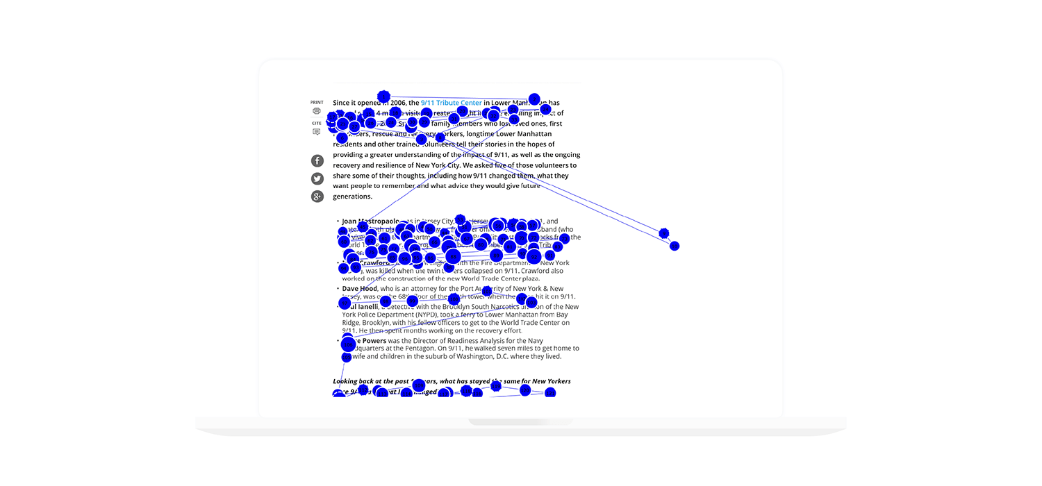
We do this by rapidly jumping our eye around to pick up different parts of the image we’re looking. Since we can only get detailed information from the central part of our vision, we have to change our focus on different parts of the content to pick up the information we need.
 Image Credit: Nielsen Norman Group
We’re looking here at what’s called a saccade. Notice these circles? These are showing how a human eye tracks different parts of a page. You’ll notice that the eye jumps around the screen to get a fuller image of the information presented.
What’s interesting is that you’ll notice that not every part of a page or information delivered gets equal attention, and some areas don’t get any attention at all for that matter.
Our eyes scan pages and quickly decide what’s important and what doesn’t deserve any focus. You might have also noticed that the eye paid more attention to the left side of the screen. Why is that?
Think about the language.
If you’re reading a Western language, you’re most likely reading things from left to right. Our brains and eyes work with the semantics and rules of the language we’re using to sort through information.
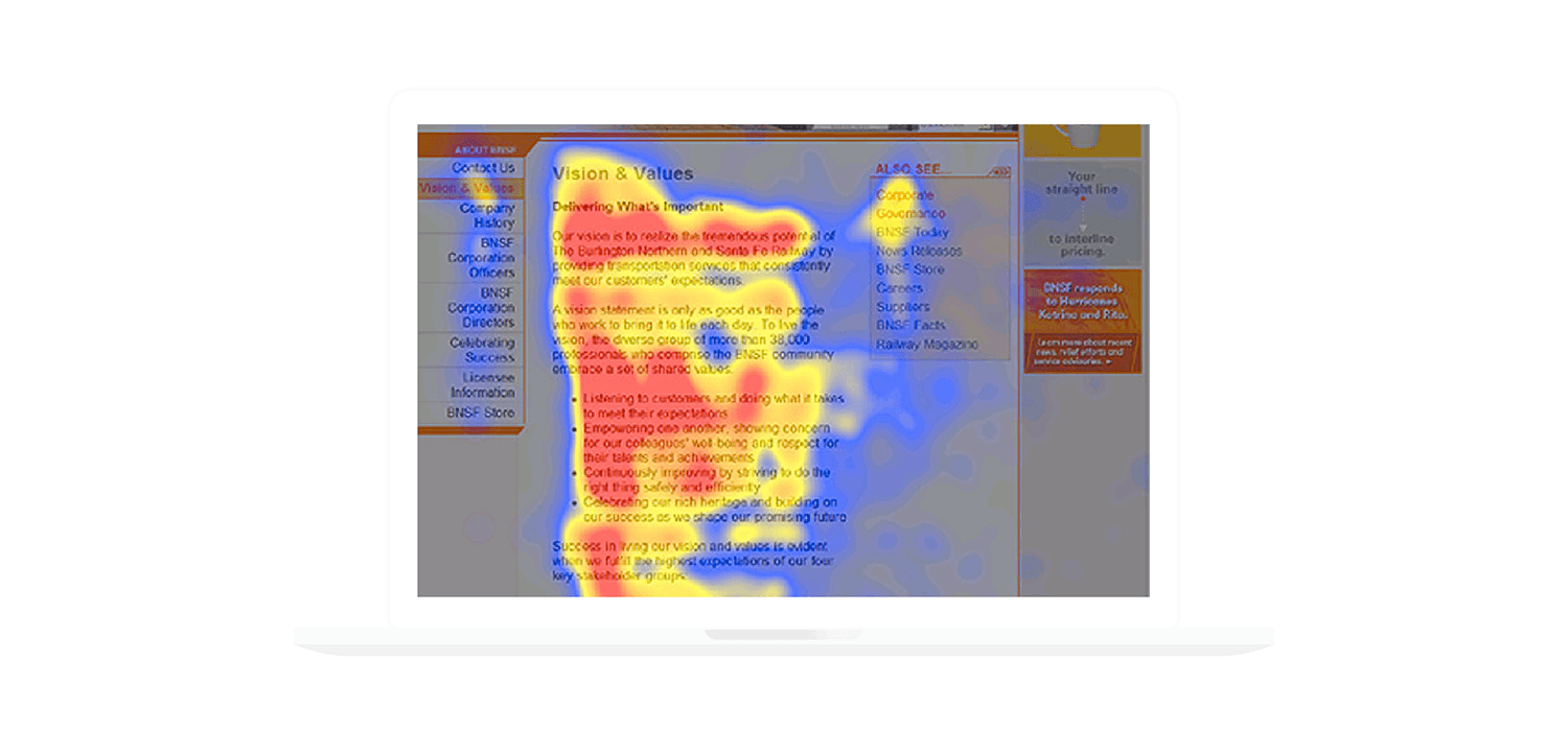
What we’re looking at here is called a “heat map”. The heat map uses eye-tracking technology to record where users fixate their attention on a screen. The red areas are where most users spent time looking at the page, followed by yellow, then blue. The grey areas are places where most people paid almost no attention.
Let’s take a look at the pattern used in this heat map.
You’ll notice that there’s an ‘F’ shaped reading pattern when looking at the content.
Notice how the majority give the first line the most attention, but as they go further down a page, their attention or interest drops. Typically users will read the first line, a bit of the second, then that usually shrinks down to reading a word or two of each line to see if the information looks relevant as they scan through a page.
Of course keep in mind that if you’re designing for a non-Left-to-Right language such as Arabic or Hebrew, then the same rules apply but are flipped/rotated to move with the language’s read-direction. So in the case of Arabic, it’s safe to assume it’ll be a vertically flipped F pattern.
Why do we read in F-patterns?
We typically begin scanning pages in an F-pattern when the content has little to no formatting. Think of a wall-of-text with no bold characters, subheadings, or bullet points. We also use the F-pattern when we’re trying to be efficient with information scanning, or if we’re not committed to reading every single word. The vast majority of users want to finish their tasks as fast as possible using the least amount of effort, and as a result, they’ll default to the F-pattern.
The Different Read Patterns
It’s good to keep in mind that there are different reading patterns.
Quoting a list from NNGroup, and I’ll place the link at the end of the article:
Layer-cake pattern
The layer-cake pattern occurs when users scan headings and subheading but skip the text content below.
Spotted pattern
The spotted pattern occurs when users skip big chunks of words. This pattern occurs when a user is looking for a specific keyword or element such as a link.
Marking pattern
The marking pattern occurs when users keep their eyes focused on one place as they scroll through a page.
Bypassing pattern
The bypassing pattern occurs when users skip the first word of a line when multiple lines start with the same ‘word’.
Commitment pattern
The commitment pattern is the rarest one because it occurs when a user is committed to reading every single word on the page. This pattern occurs when a user is highly motivated and interested in the content.
The problem we face with an F-pattern is that people tend to miss the most important chunks of information in that might be relevant to them, just because they’re on the right side of the screen.
Understanding how read-patterns work will allow you to arrange and format information in a more efficient manner.
Final Thoughts
What do we learn from this?
The most obvious answer is: You should place important information or actions in a position that encourages high visibility. The less obvious answer is that our language heavily dictates how we search through information.
We need to understand how humans perceive information to optimize how we present an interface or a design. We can optimize our designs to drawing user attention using formatting techniques, using efficient wordings for headings, or even cutting out unnecessary content.
I’ll discuss techniques on how to arrange information for efficient delivery in a future post.
If you don’t create a system of efficient information delivery, your users will create their own shortcuts, and as a result, risk missing out on the information they’re seeking because of poor design. You either take the time and make the experience support a user’s quest, or they’ll do it themselves, and possibly miss out on what you have to offer.


