The Ten Usability Heuristics
-
 Moe Hachem
- January 24, 2021

A designer’s biggest challenge is figuring out if they are on the right path during the design process. The Ten Usability Heuristics is what you can call the Ten Commandments of Interaction Design. I’d go as far as to say they’re a non-negotiable part of the process.
Jakob Nielsen and Rolf Molich established the heuristics in 1990. The heuristics are more of a rule of thumb rather than specific guidelines. Nielsen further developed and refined these heuristics four years later based on an analysis of 249 usability issues to create an easy to understand set of heuristics. The heuristics are have remained relatively unchanged since their first conceptualization but are still very relevant today and the foreseeable future.
I’m not covering any new or mind-blowing content, all credits go to NNGroup for sharing it’s vast array of UX research for all designers to benefit from. While Usability Heuristics had interaction design in mind, they still present crucial guidelines to follow for all design fields. They have a place in architecture, (physical) product design, and any other design field.
Without further ado, let’s get started:
1) Visibility of system status
Your design must always keep the user aware and informed about what is happening, and provide appropriate feedback within a reasonable time.
Okay, but why? Why is this important?
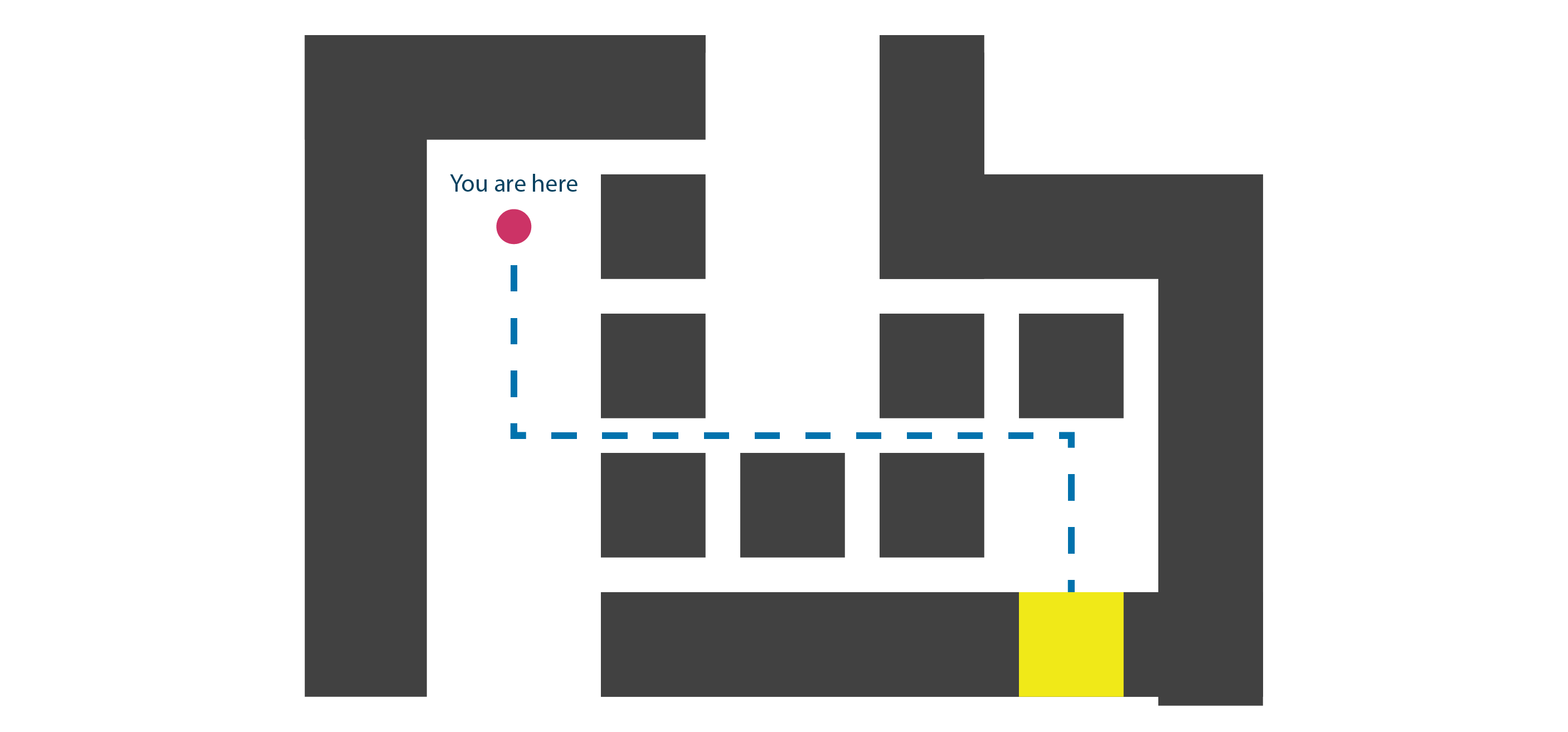
Think about location indicators in malls. They give you a clear idea about where you are within the mall, and instructions on how to get to the store you want. You memorize the directions and follow them. If you took the wrong direction, you might run into another mall map that tells you where you are, and it’ll correct your mistakes by showing you the path you need to take to get to your goal. The maps help you understand where you are within the mall, and the steps you need to reach the store you want.
The same principles apply on the screen as well. If you’re entering your username and password, the interface should include a status update that tells you when you’ve successfully logged in, or when your combination is wrong. How frustrating would it be to hit the “Sign In” button if it’s not telling you where you went wrong?
A visible system status allows you to create a channel of communication between you and the user. When you present immediate and appropriate feedback, you’re allowing users to learn what went wrong, and how they can determine what their next steps should be. Clear transparent communication generates trust.

2) Match between the system and the real world
The design should present itself as naturally as possible. The design should speak the users’ language rather than focusing on specialized jargon or interactions. In other words, draw from real-world experiences.
Your designs need to address their target audience. Some designers tend to overlook this factor and inadvertently reflect their bias in their work. It’s crucial to be aware that just because you understand a specific concept or element, doesn’t mean others will.
Designing while borrowing from real-world experiences and conventions will create what’s called a ‘natural mapping’. Natural mapping refers to design patterns in which user input corresponds to the user’s desired outcomes.
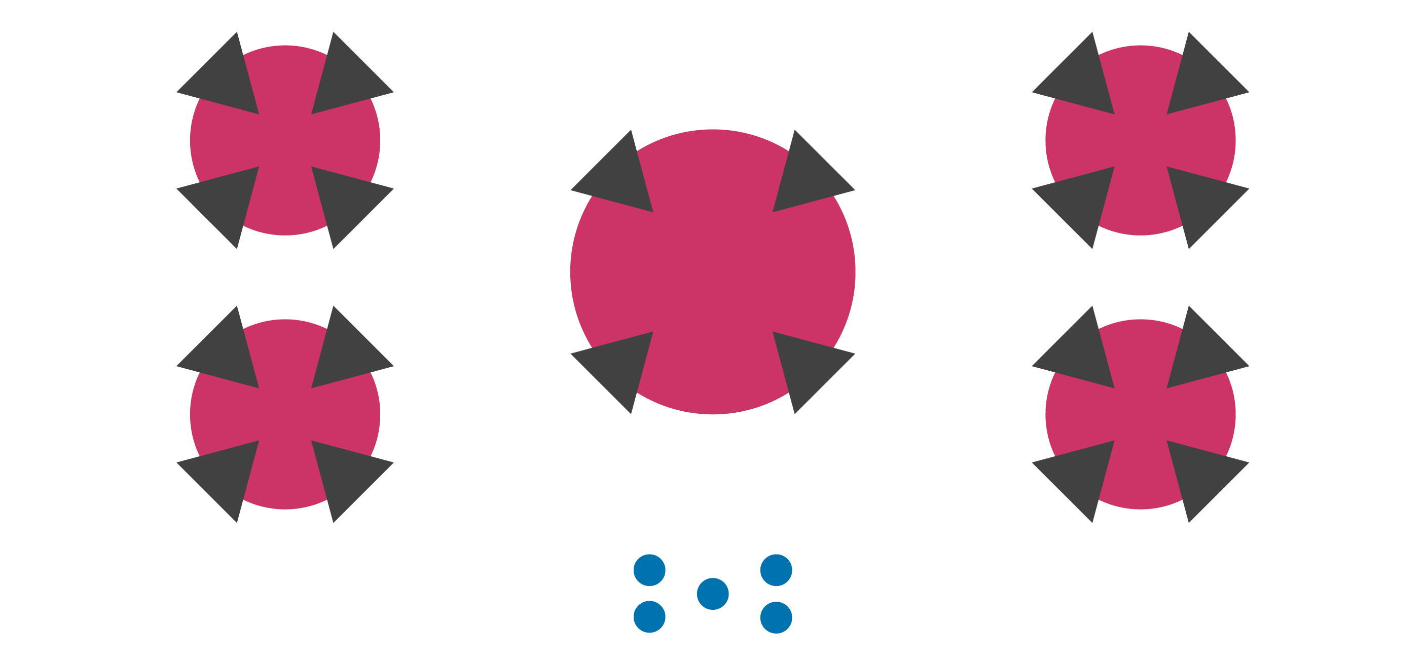
NNGroup uses an example of a stovetop and its controls, which is a perfect example. Stovetops are very infamous for giving users a hard time understanding how the control dials map to each stovetop. Many stovetops tend to place their controls in a single row/column with small icons that try to teach users the relation between each dial and stovetop.
Does it work? It does, but poorly. Things get more frustrating when the icons wear out over time, and more so you have a brand new user. Now, what if you map the button controls in a similar layout to the stovetops? It becomes more intuitive because you now have a visual reference. Not many stovetops opt for this option because it tends to be space-consuming, but the question then becomes: is it worth sacrificing usability for space or aesthetic purposes? (Hint: No).
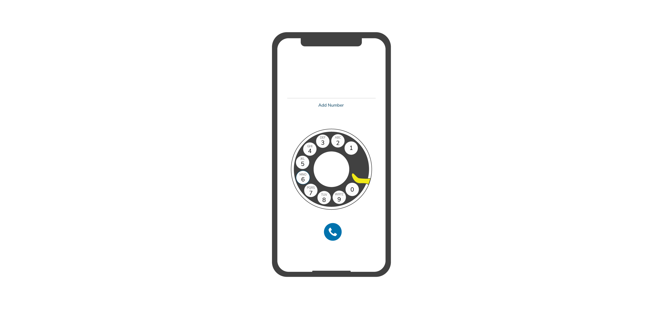
Another example would be that of a mobile keypad. Compare your smartphone’s digital keypad to that of an analogue phone. There’s nothing there to dictate that you must map your digital keypad like an analogue phone’s keypad. You could have had a completely different design, but you’d be forcing people to re-learn how to interact with a phone when you’ve already got a globally established standard, so why re-invent the wheel?
When it comes to jargon, let’s imagine we have an architectural modelling app with architectural elements you can drag and drop. What if two of these options were “architectonic element”, and “fenestration”? Will most users understand that you’re talking about a “wall” or “window” respectively? I doubt most architects would, let alone non-architects.
It’s important that your designs are understandable and don’t use specialized words or concepts. You shouldn’t assume that just because you know what a word/concept refers to, that other people will understand it too. The only way to figure this part out is to conduct user research to uncover what your target users are familiar with, as well as their established mental model.

3) User control and freedom
Give your users control and freedom, and an ‘emergency exit’ from situations they might have accidentally gotten themselves into without making the process long or hard.
When it’s easy for users to undo or back out from a process, they’ll feel more confident using your system. Your design system should allow users to remain in control and avoid getting them stuck or trapped in a cycle of frustration.
Think of it this way - You accidentally hit a delete button, but you never intended to delete what you just deleted. There are three different ways you can go about this as a designer:
You can tell the user ‘tough luck sucker’ - If you’re doing that, you shouldn’t take a long hard look at the path your career is taking.
You can give the user a pop-up of sorts to have them confirm their action. The idea being they might have a prompt that asks them “Are you sure you want to delete X?“. You might give the user the option to undo or redo any action. You could also combine both solutions depending on the context.
What you want to do is see if your system can support an Undo/Redo action. You’ll want to give the user an option to abort a process through a visible Cancel button.
How does this apply to other design fields? Let’s look at architecture, for example:
This heuristic is akin to having clear emergency exits in a building. Easy-to-follow signage and architectural layouts make it easier for occupants to get in and out of the space. Try and remember a situation where you entered a building only to find yourself lost in a labyrinth-like layout that made it hard for you to exit.

4) Consistency and standards
Your designs should be consistent. Avoid putting your users in a situation where they wonder whether a specific action or element will have the same result between different pages. Create a standard and stick to it.
Be consistent with your design guidelines, but refer to external products. I like to reference Jakob’s law here, where he said something along the lines of:
Users will spend most of their time on other sites, which means that they’ll also prefer that your site works the same way as the other sites.
In other words? Design using patterns users are accustomed to and avoid creating new interaction patterns when you have no reason to do so. If you choose to create a new interaction pattern, you’ll be placing a heavy cognitive load on the users since they’ll need to learn a brand new interaction pattern.
Think of it this way: A checkbox option indicates that you can select multiple options, whereas a radio button tends to mean you can choose one. It’s an established pattern and standard at this point. Don’t change this interaction pattern and reverse it so that you can have a multiple selection radio button - Unless you want your users to curse you, then go ahead.
In other design fields, and I’ll parallel this with architecture: Look at how architectural standards will number or name floors. If you’re labelling a building in Europe, and probably most of the world, you’ll call the first floor you enter the building through, the Ground floor. You’ll want to stick with this standard if it’s established in your region to avoid confusion. Now if you’re in the US, you’ll probably name the entry floor as the First floor.
Imagine the confusion you’d run into if you’re used to the entry-level being the “Ground Floor”, and you need to get to the second floor. In the US, you’d want to be going to the “Third Floor”, whereas in Europe you’d be looking for the “Second Floor”. There’s a lot of confusion that’s going to happen, so you need to be aware of the standards present in your work context.
To summarize: Improve your design’s learnability by maintaining consistent standards internally, and drawing from externally set standards, and follow established industry conventions.

On a side note, imagine how different our interactions might be if we adopted a traditional phone dial in a digital context, or if the concept of keypads was never discovered.
5) Error Prevention
Error messages are important, but your designs must attempt to prevent the error from happening in the first place. Have your users confirm their actions before they commit to them, and make sure you eliminate conditions where the likelihood of errors occurring is high.
While we’re talking about errors, it’s quite important to highlight the two different types of errors: Slips and Mistakes.
Slips are errors that occur due to inattention, whereas mistakes occur due to a mismatch between a user’s mental model and the design. NNGroup nicely groups these as “unconscious” and “conscious” errors respectively.
In architecture, an example would be how you design stair steps. Take a look at a stair’s details. Construction standards dictate that the rise on a ‘step’ should never be perfectly vertical, but should jut out slightly, or have nose/tread attached to it. It’s a minor intervention, but it reduces the chances of you hitting the step, tripping, and falling. It gives you a bit of a safe ‘space’ to make sure yo u’re going up the steps as naturally as possible. You can view this as the equivalent of slip-prevention since we aren’t conscious of how steps work to prevent rather painful errors.
Using the example of stairs, you’ll also notice that buildings with steps outside their doors will typically have at least two risers, instead of just one. The reason being if you’re only using one step, you’ve increased the likelihood a person will miscalculate their step and land poorly on their way out of a building. You can view this as the equivalent of a mistake-prevention because the ‘steps’ do not follow a user’s mental model.
One important method to prevent mistakes is by reducing the burden on a user’s memory, supporting undo/redo actions, and asking users to confirm their actions. As you go over your designs, prevent cases where errors will cause serious problems, and then go over the minor-frustrations. The reason you’d want to do this is to make sure the real headaches are solved first. To avoid slips, you’ll want to add some constraints and default values that help the users along their way.

If you’ve read about the incident you probably know what I’m referencing, otherwise you might want to have a read about how a UI error caused widespread panic in Hawaii in what was dubbed the False Missile Crisis. I’ll leave a link to this event in the references at the end of the post.
6) Recognition over recall
This heuristic ties closely to point 4 (consistency and standards).
You want to minimize a user’s memory load by making elements, actions, options, and vital information visible. You don’t want users to memorize information from one screen to execute an action on another screen. The information that your users need should be visible or easily accessible when required.
We have limited short-term or immediate memory. Human tend to struggle to remember more than seven items at once, give or take two.
You want to provide users with in-context help and reduce the number of information users need to remember to help them along.
In another subtle manner, you can think of it in terms of door handles in public spaces. We intuitively understand that if a door doesn’t have a handle, it’s most likely a push door. If the door has a handle, then it’s safe to assume you ought to pull it. What if both sides of the door have handles, but the door only opens in one direction? You end up forcing building occupants to remember which direction the door swings, or try their luck. Think of it this way: How many times have you seen a Push/Pull sign but still went for the wrong action?
7) Flexibility and efficiency of use
Give users shortcuts that may speed up their interaction when they gain a certain level of expertise. By doing so, you will allow your design to cater for both experienced and inexperienced users.
Creating a flexible process to do things allows users to pick the methods that work best for them.
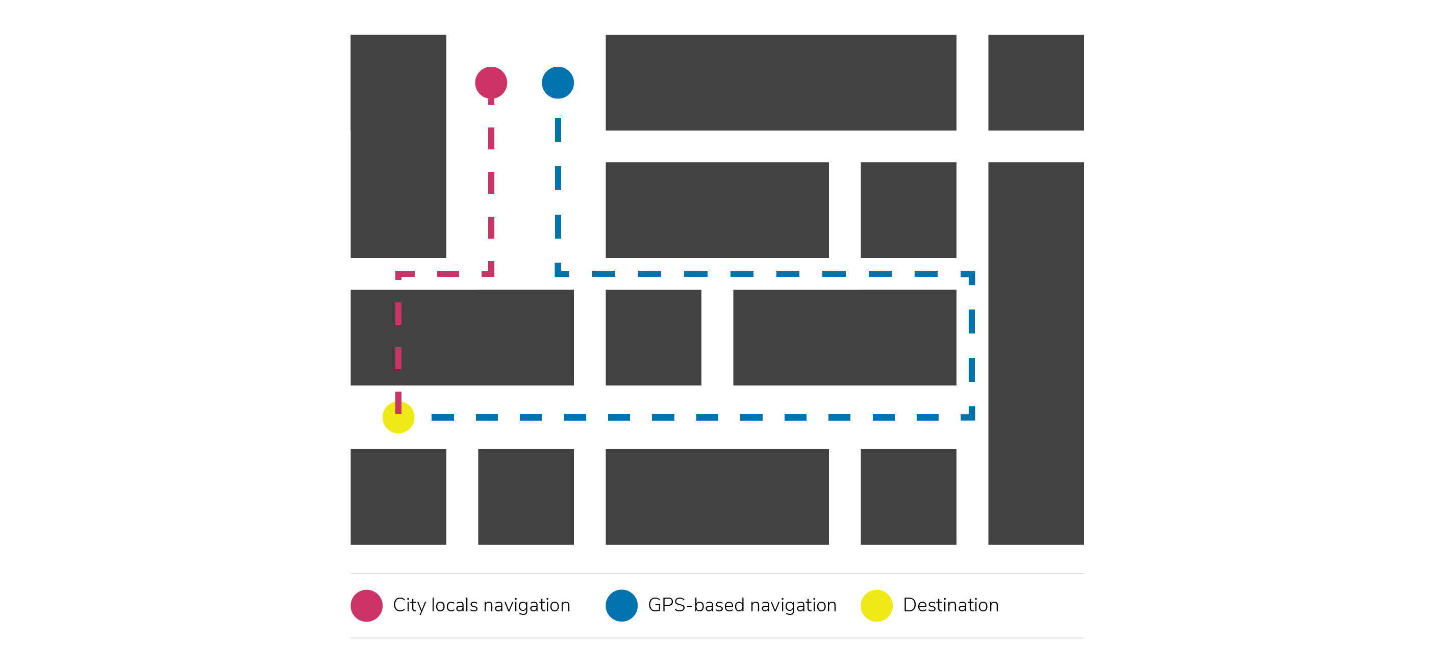
Think about how you navigate in a city you’ve never been to before. Nowadays you’ll typically use a Map application to guide you to where you need to go. The path the app chooses might not be efficient, but it’ll usually get to from point A to point B. Now compare how a local will navigate through the city. Locals know the short cuts they need to take to avoid traffic or shave off 5 minutes of their transit time because they’ve become accustomed to the city.
It’s vital to keep in mind that this is not an excuse to hide functions. You would be surprised how many people aren’t unaware of the typical shortcuts for undo, redo, or print.

8) Aesthetic and minimalist design
Your designs must only present relevant information and interactions. Every extra bit of information you add to your screen will compete with one another for user attention. Too much information will reduce the overall visibility of your main elements.
Make sure that your design only includes the necessary content for a specific screen. De-clutter your design from unnecessary information and prioritize the main elements needed to accomplish a task.
A good example would be that of a piece of ornate chair. Unnecessary decoration might negatively impact the chair’s usability. An intricately decorated chair might have sharp ridges that cause discomfort.
9) Help users recognize, diagnose, and recover from errors.
Use real-world language when informing users about errors. I think we’ve all run into errors that said something along the lines of:
“Exception processing message 0x00005 unexpected parameters.”
What on earth is that supposed to mean? How would you have figured out that this kind of error means that you might have a corrupt registry, faulty RAM, or incorrectly installed software?
Part of error recognition means that you need to make sure that users never receive error codes, or at least never receive it alone if it’s necessary to have them. Explain to your users what caused the error, give them a diagnosis, and always offer them a solution.
Make sure your errors appear in their typical visual patterns (red text, for example). The idea here is that you don’t want your error messages to blend into the design.
Road signages are great examples of error prevention. Signage makes sure you’re not heading in the wrong direction, or if we take it a bit more of an extreme example: They make sure drivers don’t cross a railroad crossing when a train is going to pass by within a few seconds.
10) Help and documentation
Ideally, your design shouldn’t need any further explanation to teach people how to use or interact with it, but you might need documentation to help some users complete their tasks.
Help documentation should be easy to search through and presented in context when you expect a user will need it. Your documentation should list the steps the users need to carry out to complete a task.
In a physical context, office buildings or hotels have reception desks that help visitors understand how to get to where they need to go.
Final Thoughts
First, let’s list down the heuristics:
- Visibility of system status
- Match between system and the real world
- User control and freedom
- Consistency and standards
- Error prevention
- Recognition rather than recall
- Flexibility and efficiency of use
- Aesthetic and minimalist design
- Help users recognize, diagnose, and recover from errors
- Help and documentation.
The truth of it is: Heuristics are crucial for the creation of any functional design, be it graphical, product, furniture, digital or architectural.
I admit first and foremost that I heavily subscribe to the school of “form follows function”. If a design looks ‘good’ but isn’t functional, then the ‘design’ has failed to achieve its goal. The heuristics create a solid guideline to follow to ensure your designs are on the right path to deliver an efficient, effective, and pleasant experience.


