Exploring Hierarchy: Hierarchy as Revolution
-
 Moe Hachem
- September 7, 2020

Some designers will call Hierarchy “Order”. In reality, the names don’t matter, but the ideas they convey do. We’ve defined what Hierarchy was previously, but here’s a quick recap:
Hierarchy relates to how design content can be understood and refers to the importance of an element within a design.
You use hierarchy to guide the viewer through each element in order of importance.
The basic idea is to sort elements in order of importance and add visual weight to contrast or emphasize importance.
Design Hierarchy Meets Social Hierarchy.
How do we even apply the “principle of hierarchy”?
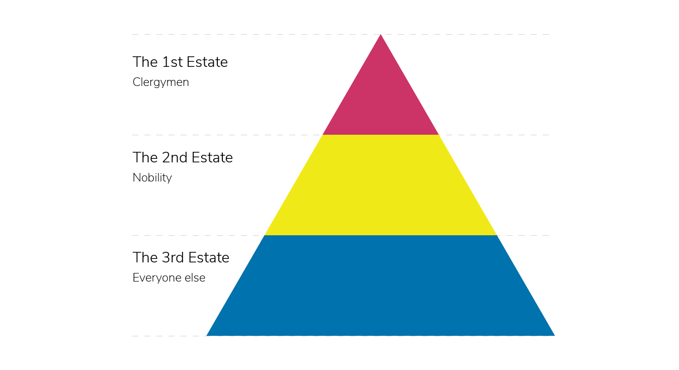
Let’s take a look at the diagram above.
I’m sure we’ve all come across this type of diagram back in school.
In this specific instance, we’re looking at France’s Estate in the times of the French Revolution. It’s a feudal pyramid that describes the different social strata in Pre-Revolution France. As you climb up the pyramid, you’ll have less area available. The nature in which us humans value something comes from the concept of abundance. When something is widely abundant, it’s perceived value goes down. Pre-Revolution France had fewer people in power and more people that were serfs serving their feudal lords.
The diagram we’re looking at does not represent the reality of Pre-Revolution times. We’re going to apply realistic proportions of what the hierarchal pyramid ought to look like:

We can consider that only 1% of the population fits into the First Estate, and another 2% fits into the Second Estate. The remaining 97% of the population fits into the Third Estate. Depending on your mindset, you can view the hierarchal order in two different ways:
- The First Estate is the least abundant, and as such is the most important.
- The Third Estate is the largest, which means the First and Second need it to exist.
Hierarchy Through Another Angle.

The First Estate creates order over the Second Estate, which directly controls the Third. We can say that the First influences the Second and Third, but it’s influence on the Third highly relies on a cooperative Second Estate.

Let’s imagine the First Estate as a datum that holds a feeble balance. It’s not far-fetched to argue that it takes only one unhappy Estate to bring disorder to order.
It’s interesting to see how the Third Estate looks more influential than the Second Estate but also supportive of it. They look like they both willingly work with one another.
What happened after the revolution? The First Estate fell.
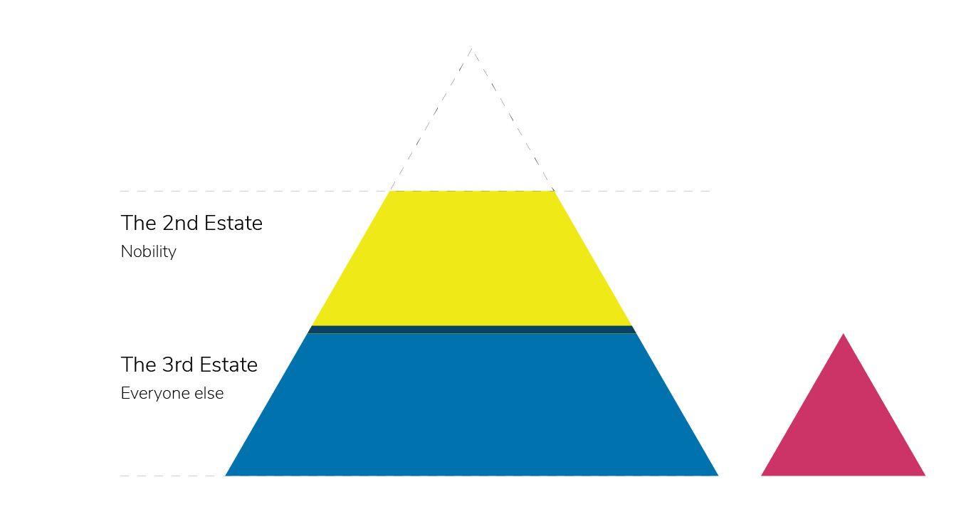
Now we have a small triangle on the side that no longer has any real influence, a leftover element of the past.
In Architecture and Construction, there is a principle called “The Angle of Repose”.
The basic idea behind the principle is as follows: If you pour sand on the same spot, your the sandpit will grow in height. It will keep growing until it’s height creates a steep enough angle on the sides that forces any excess sand to slide down to the base.
If we look at how history went, we see the same thing occur.
We know for a fact that when the First Estate fell, the Second Estate quarrelled over the mantle left behind. Of course, not everyone within the Second Estate will be able to fill in the power vacuum. The individuals or families that succeeded to grab a seat at the big boy’s table managed to do so because they were popular among the Third Estate.

In an ironic twist of fate, we went back to square one but with different names.
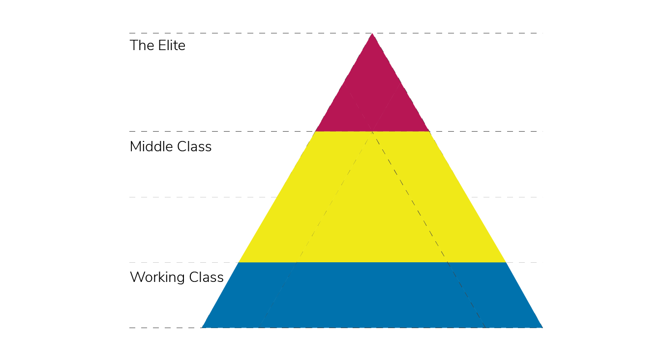
Forcing Hierarchy I
Let’s take a step away from politics and re-examine the triangle.
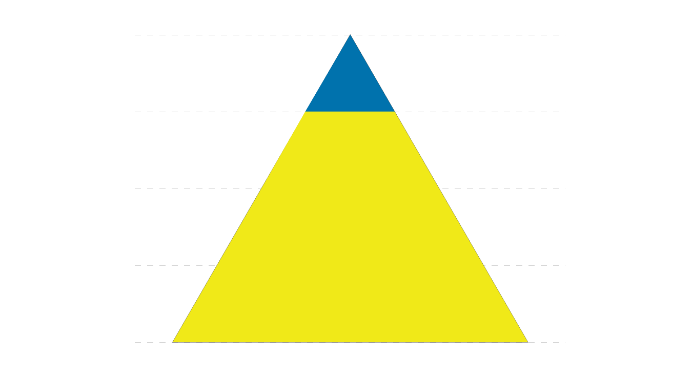
Previously the topmost part of the triangle was considered the most valuable part of the triangle, but we can negate that through colour.
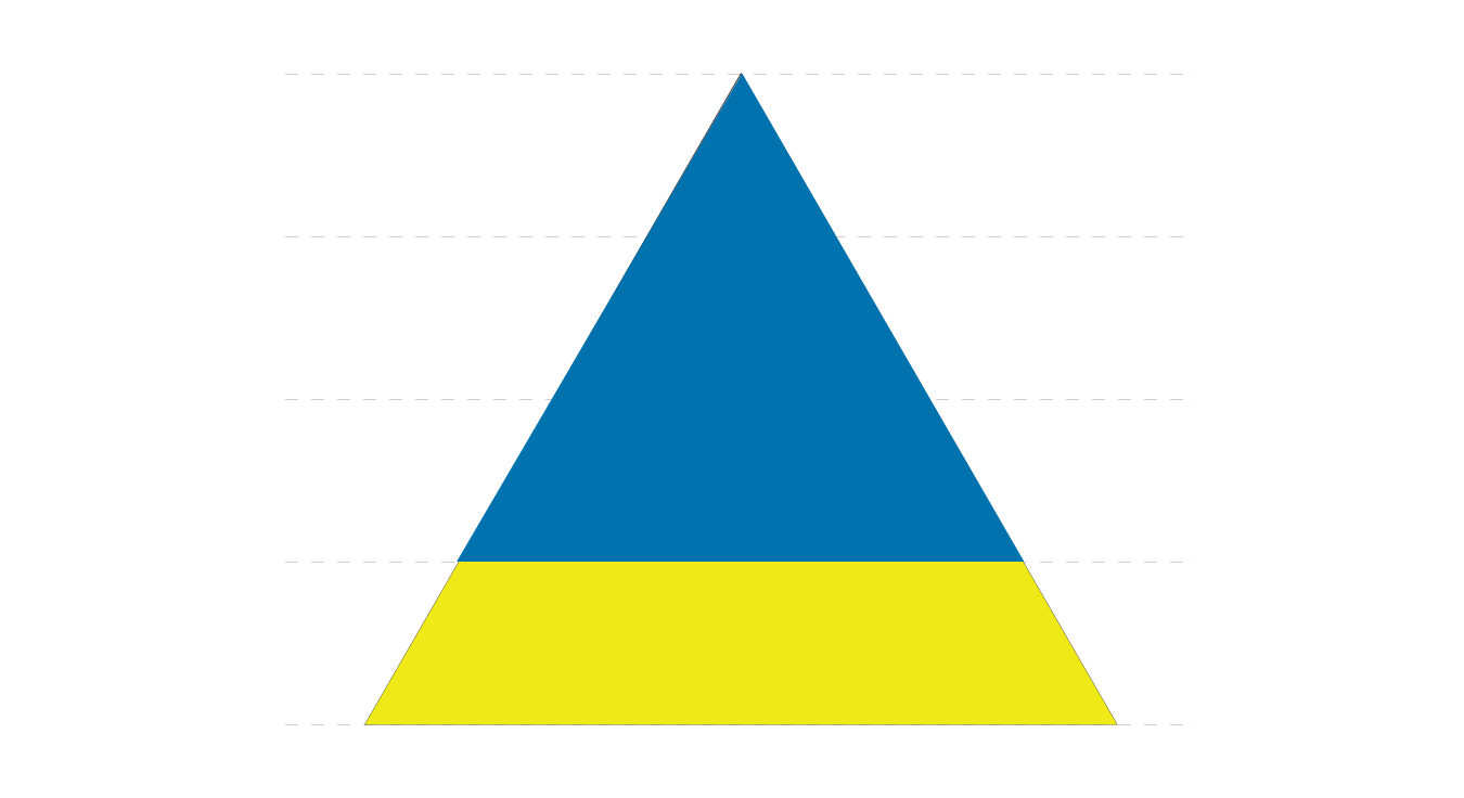
We don’t want to overdo it with the colour though otherwise, we’ll be back to where we started.
The Nature of Visual Hierarchy.
Let’s say we have a set of rectangles of varying proportions.

The largest element in a composition will naturally draw our attention. One of the reasons why we see this happening here but not the previous examples is because these are individual elements, and as a result, are weighed separately. With the example of the triangles, we were looking at areas confined within the same shape, and when we differentiate a part of it, we give it more attention.

We’ve done the same thing we’ve done previously with the triangles, by applying colour, we’ve managed to divert attention to the smallest piece.
Forcing Hierarchy II

When we have objects laid out with the same dimensions, it’ll be hard to establish a clear hierarchy. You might read the hierarchy left-to-right while a Middle Easterner might read it right-to-left.
Our minds will create “hierarchy” if it can, even if it does not exist. As such, it’s always better to be able to create a “hierarchy” intentionally.
We can establish a hierarchy by emphasizing minor differences.

It’s easier to establish a hierarchy using this scenario, even if the elements do not have exaggerated height differences. We can emphasize the difference to make the hierarchy clearer.

We can apply colour to create a clear winner, but just like the example of the triangle, we need to be careful otherwise we’ll end up back in square one.

Colour isn’t the only way you can create clear a hierarchy. It just happens we’ve been using colour as an example, but you can introduce an intervention such as shape.

The reality of the matter is, it doesn’t matter what you choose to use to establish a hierarchy or to force a specific read order, but it does matter that you do so appropriately.

If you do decide to create “Hierarchy” haphazardly, your viewer might still be able to make some sense out of the composition, but you risk losing their interests or the message you wanted to deliver.
Final Thoughts
The principle of “Hierarchy” helps viewers better understand the message or experience by creating a clear flow and highlighting the pieces of information. Our minds want order, and if you do not provide it to your audience, your audience will provide one of their own. Maybe that’s something you want to do intentionally, perhaps to encourage a user to think more about a subject matter or inspire them to explore it further. Even then, you still need to design your elements in a manner that will encourage that type of exploration, and it’s not a get-out-of-design free card.
There are multiple ways you can express a hierarchy, and you must choose the manner that delivers your message best. Are you highlighting the First Estate, or are you trying to empower the Third Estate? These are design decisions with psychological implications where you must choose between oppressing or liberating your audience.
I encourage you to play around explore the different ways you can express the principle of “hierarchy”. Play around, and see how you can further twist the narrative of the estates.
I’d love to see what you create!


