Data-Driven redesign of the Ecomz website
Ecomz needed a marketing website that effectively represented its new branding and converted visitors into customers.
- Project lead
- UX/UI design
- Front-end development
- Project management
- Art direction
Not published
- 1333% Increase in conversion rates
- 95% Sales team utilization rate
- AA WCAG compliance
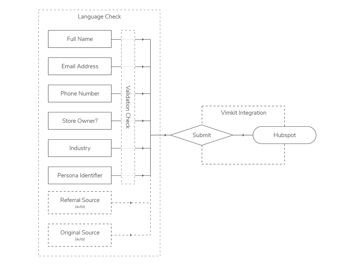
- Developed custom HubSpot forms with phone number validation and source tracking.
- Simplified the site structure to focus on quality over quantity.
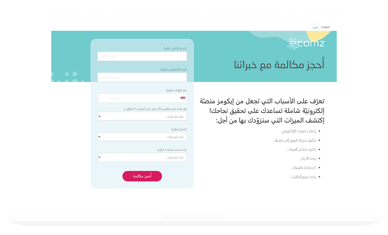
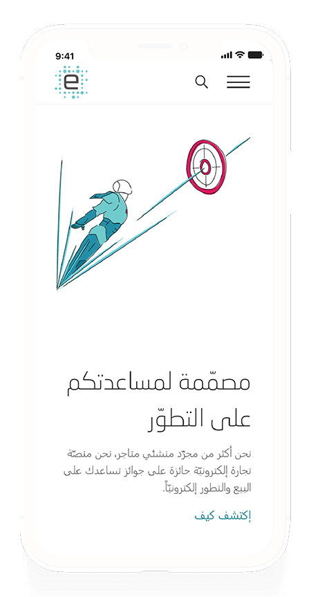
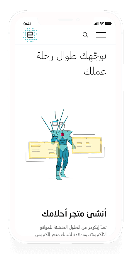
- Developed a language-responsive design with RTL alignment for Arabic.
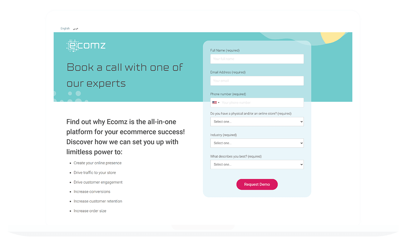
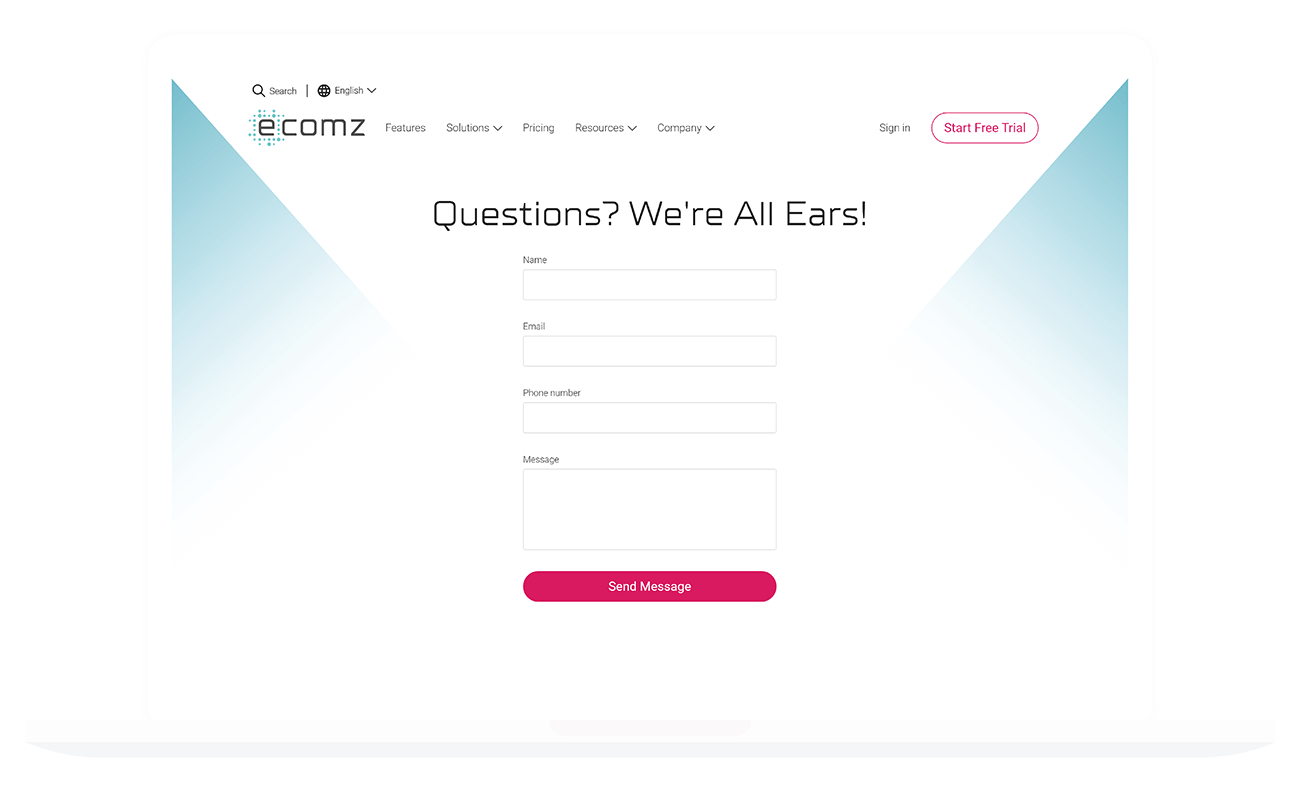
- Streamlined contact forms to improve completion rates and request categorization.
Boosting conversion rates by aligning user needs with business goals through strategic design and localization.
Executive Summary
My Role
- Project lead
- UX/UI design
- Front-end development
- Project management
- Art direction
Scope
- Website redesign
- Accessibility improvements
- SEO strategy
- Multi-language support
- Hubspot integration
Business Problem
Ecomz needed a marketing website that effectively represented its new branding and converted visitors into customers. User research revealed that the website was difficult to navigate and lacked structure, correlating with poor SEO, traffic, and conversion rates.
User Problem
Users found the old website confusing, with inadequate content that didn't clearly address pain points. The platform is based in the MENA region, but the lack of Arabic language support made local users hesitant about joining.
Project Management & Art Direction
Engaged in daily stand-ups with marketing to ensure brand consistency. I worked closely with the in-house designer to finalize the visual identity, ensuring all elements aligned with strategic goals.
HubSpot Integration & User-Friendly Design
Developed custom HubSpot forms with phone number validation and source tracking. This setup captured leads efficiently and saved the company $1,250 annually by eliminating expensive subscriptions.
Theme Store Development
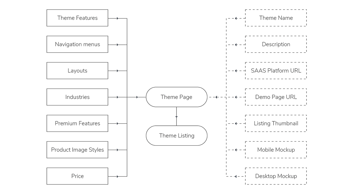
Developed a dynamic theme store by structuring databases for themes, tags, and features. This allowed the marketing team to manage the store without code intervention.
Dynamic Theme Store Interaction
Sales Team Utilization
The redesign streamlined lead generation and reduced customer confusion, resulting in a 95% sales team utilization rate. The team could focus on closing deals rather than managing queries.
Market & User Research
Conducted a deep dive into competitor sites and user analytics. Research revealed that the previous website's complexity was a major barrier. Users felt overwhelmed by excessive information, and the lack of localization created doubt about the platform's capabilities.
Stakeholder Identification
We defined personas emphasizing small to medium-sized business owners. In the MENA region, target customers preferred paying a premium for setup services rather than a DIY approach, largely due to the perceived complexity of the platform.
Site Architecture
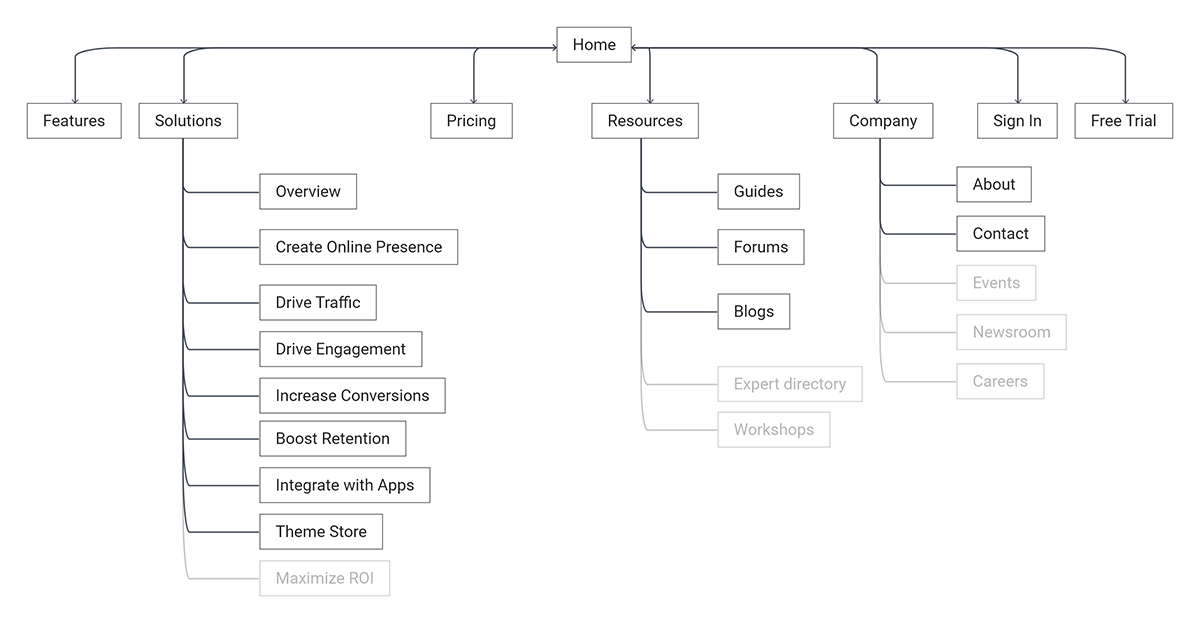
Simplified the site structure to focus on quality over quantity, prioritizing essential pages to improve navigation and SEO.
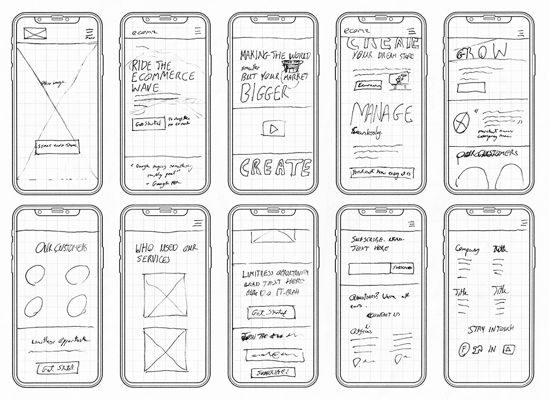
Wireframes & User Flows
Created detailed wireframes to map the user journey, ensuring intuitive navigation from entry points to conversion actions like demo requests.


Typography & Prototyping
Selected TTSuperMolot Neue and Roboto to match the brand. I created high-fidelity prototypes with interactive elements for usability testing, iterating based on feedback from stakeholders and users.
Front-End Development
Implemented fully responsive designs and integrated necessary tools like analytics. I oversaw the complete lifecycle, ensuring cross-browser compatibility.


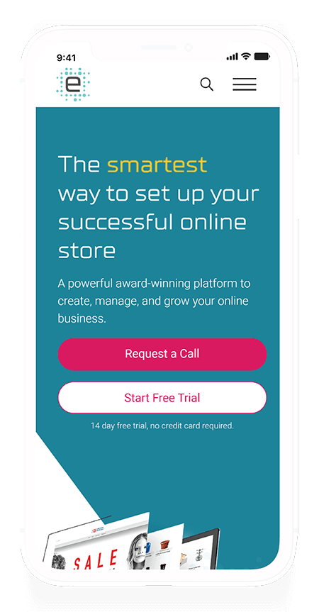
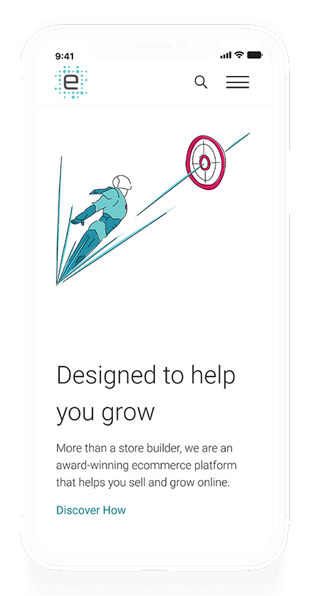
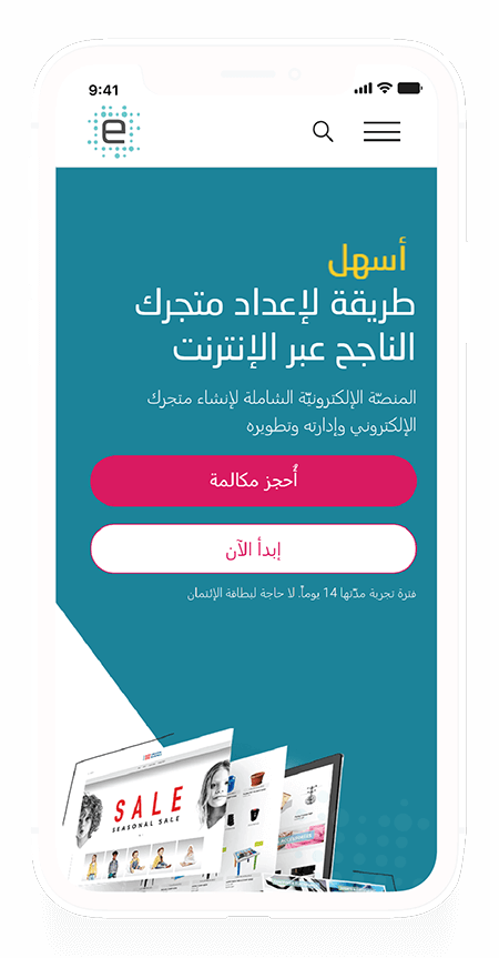
Mobile Experience
Optimized the mobile experience to ensure seamless navigation and engagement on smaller screens.
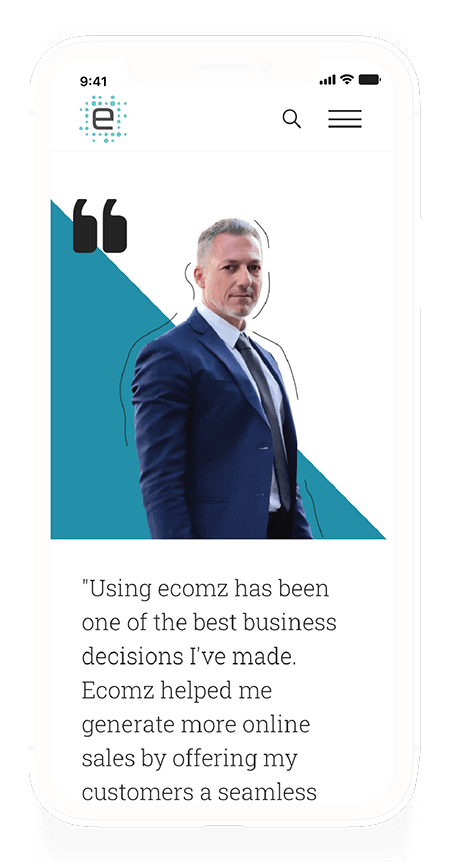
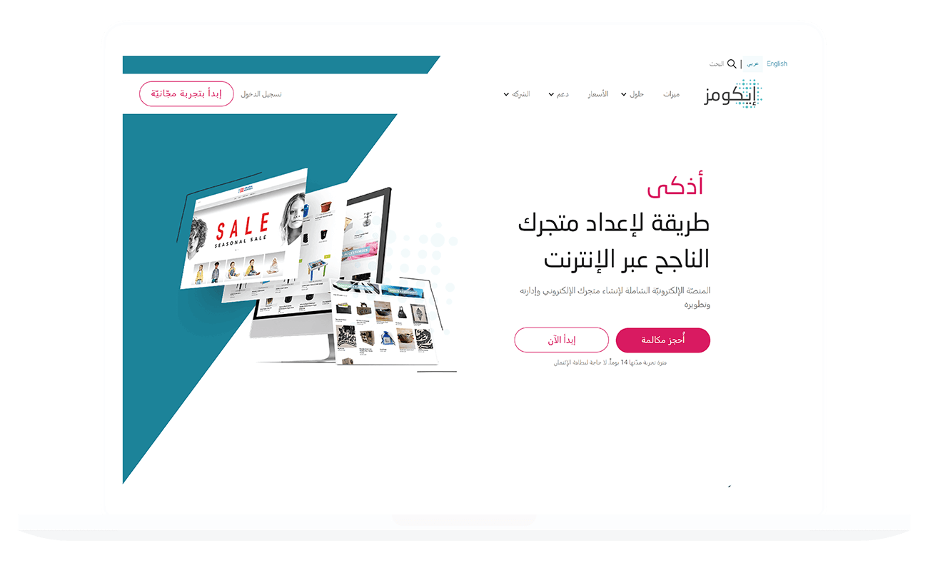
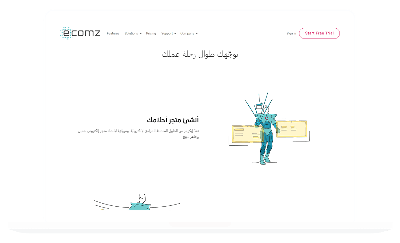
Multilingual Support (Arabic)
Developed a language-responsive design. Elements automatically align right-to-left (RTL) for Arabic, ensuring a localized and native experience.
Contact & Error Handling
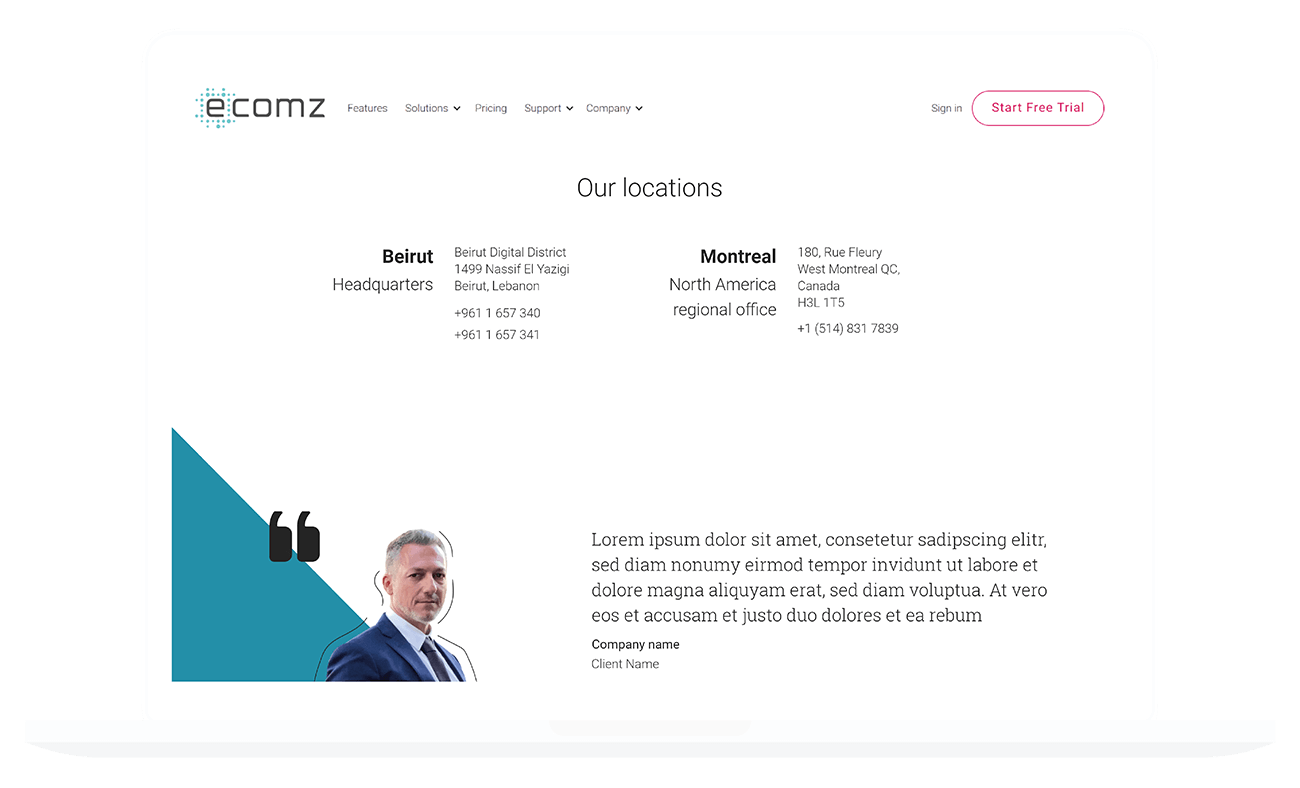
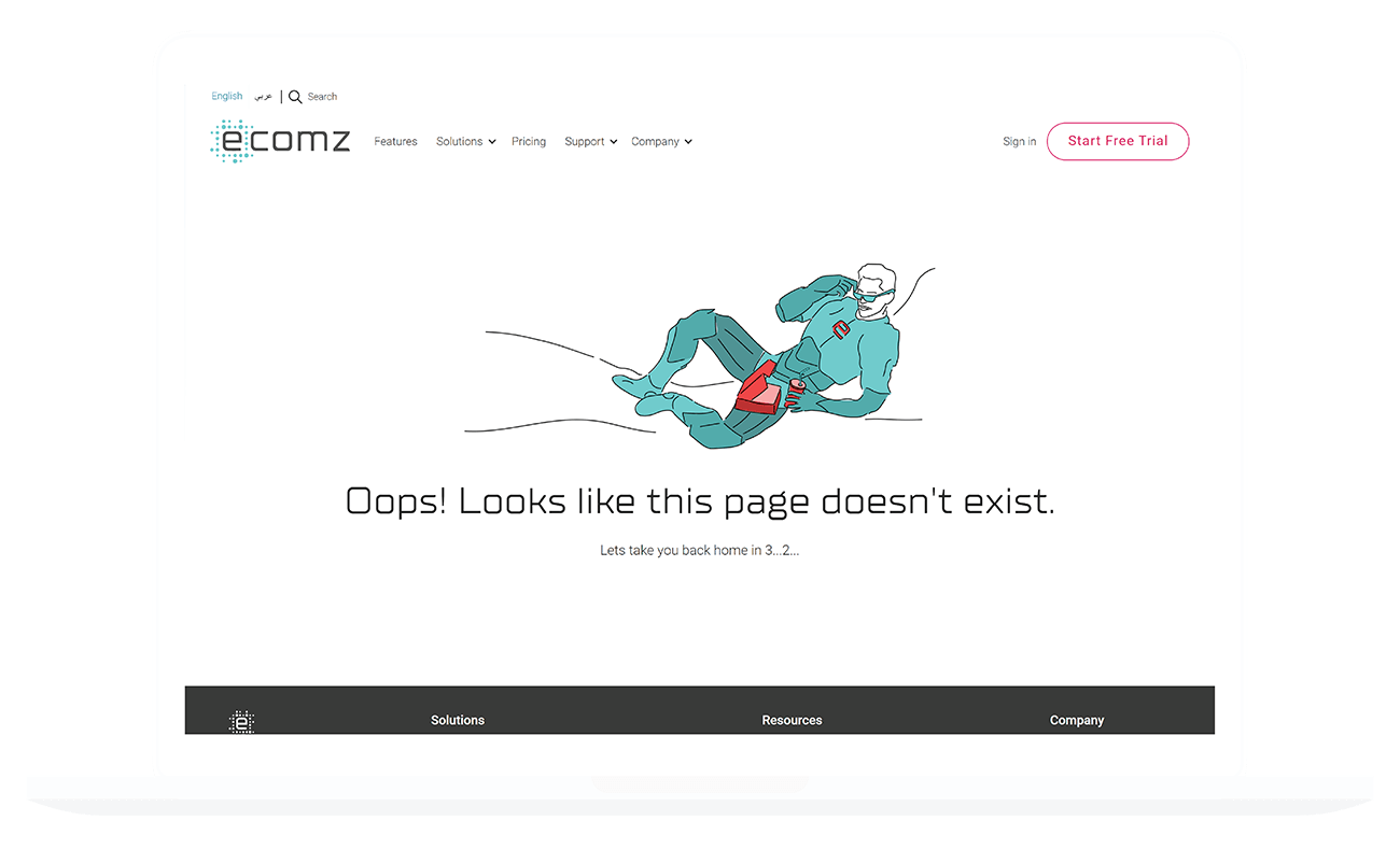
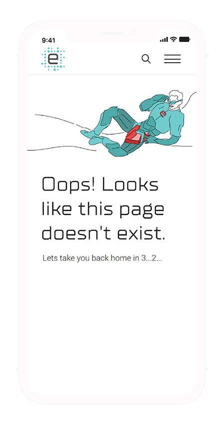
Streamlined contact forms increased completion rates. specialized forms allowed the sales team to categorize requests. I also redesigned 404 pages to keep users engaged and reduce bounce rates.
SEO & Performance
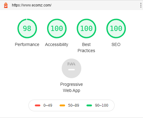
Enhanced SEO with keyword-rich content and optimized images. The site achieved a high performance score, loading in under a second.
Looking for similar results?
Let's discuss how I can help you achieve your goals.
Let's move your product forward
Working on something that needs a clearer path from strategy to execution? Let's talk. I typically reply within 24 hours.