Leveraging data-driven insights for a grocery delivery startup in a challenging market
Oasis aimed to penetrate the rapidly growing online grocery market in Lebanon, where COVID-19 had accelerated the demand for digital grocery solutions.
- Co-founder
- Product management
- UX/UI design
- User Research
- Customer experience management
- Brand Strategy and Communication
Not published
- 32 NPS Score
- 84% Task completion rate
- 25% User adoption rate
- Implemented a streamlined hand-off process with clear annotations to reduce rework.
- Allowed users to reject specific items upon delivery to address quality concerns.
- Designed a simple registration flow with OTP or social media options.
- Built a homepage with a prominent barcode search feature for quick item finding.
Executive Summary
My Role
- Co-founder
- Product management
- UX/UI design
- User Research
- Customer experience management
- Brand Strategy and Communication
Scope
- Full app design and development
- Market research and competitor analysis
- User journey optimization
Business Problem
Oasis aimed to penetrate the rapidly growing online grocery market in Lebanon, where COVID-19 had accelerated the demand for digital grocery solutions. However, the market was saturated with competitors, many of whom struggled with accessibility, usability, and geographical limitations. Our goal was to create a product that not only met user needs but also addressed the gaps left by existing solutions.
User Problem
Users in Lebanon faced several challenges that deterred them from using online grocery platforms. Many people did not trust card payments, preferring the security of cash transactions. Additionally, there was a significant distrust in the quality of perishable products like vegetables and meat. Households were hesitant to order these items online, preferring to physically inspect their food.
Project Management
Agile & JIRA: Employed JIRA to manage sprints using Epics and Stories. The MoSCoW method was utilized to prioritize features, ensuring critical elements like accessibility and payment security were addressed first.
Sprint Planning: We scheduled regular sprint planning and review sessions to ensure design and development efforts stayed aligned with evolving market conditions.
Branding
The branding for Oasis was designed to evoke a natural, hygienic feel, using earthy tones like green, blue, and brown. Typography was chosen for clarity and readability.
Workflow Optimization
- Work Hand-off: Implemented a streamlined hand-off process with clear annotations to reduce rework.
- Market Research: Integrated continuous research into the workflow to allow for iterative strategy adjustments.
- Quality Concerns: To address distrust in perishables, we allowed users to reject specific items upon delivery, using this feedback to improve supplier interactions.
Competitive Analysis
Conducted a thorough analysis of existing grocery delivery apps in Lebanon. Key findings included:
- Most applications failed WCAG accessibility requirements.
- Basic UI/UX best practices were often ignored.
- Apps had limited geographical coverage.
- OTP verification was widely adopted for registration.
User Research
Our research involved interviews and usability testing with our primary target: Lebanese mothers aged 40-60, who are key household decision-makers. They preferred:
- Cash transactions over card payments.
- Reassurance regarding price competitiveness (belief that online is more expensive).
- High-quality perishables (belief that online quality is lower).
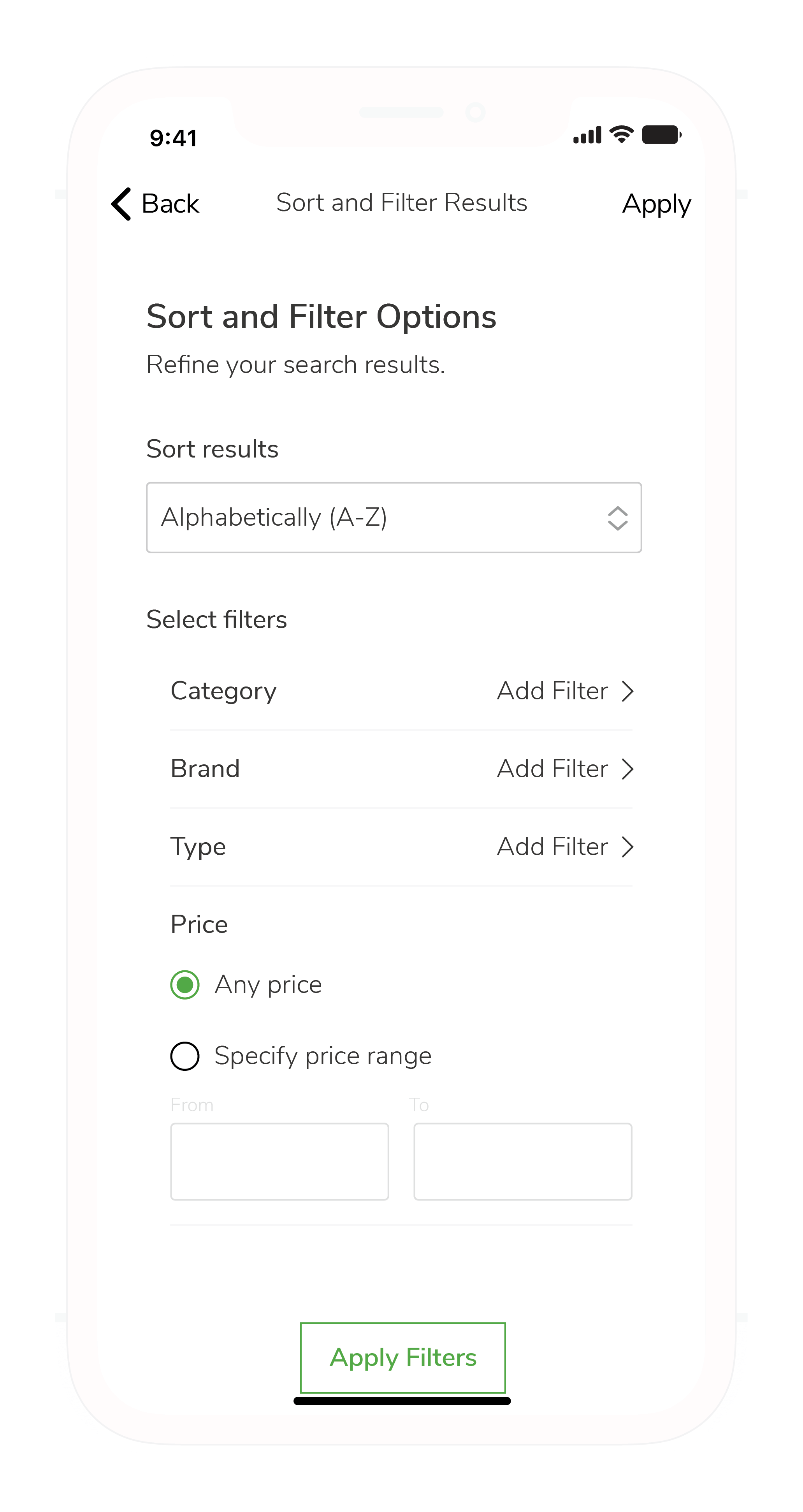
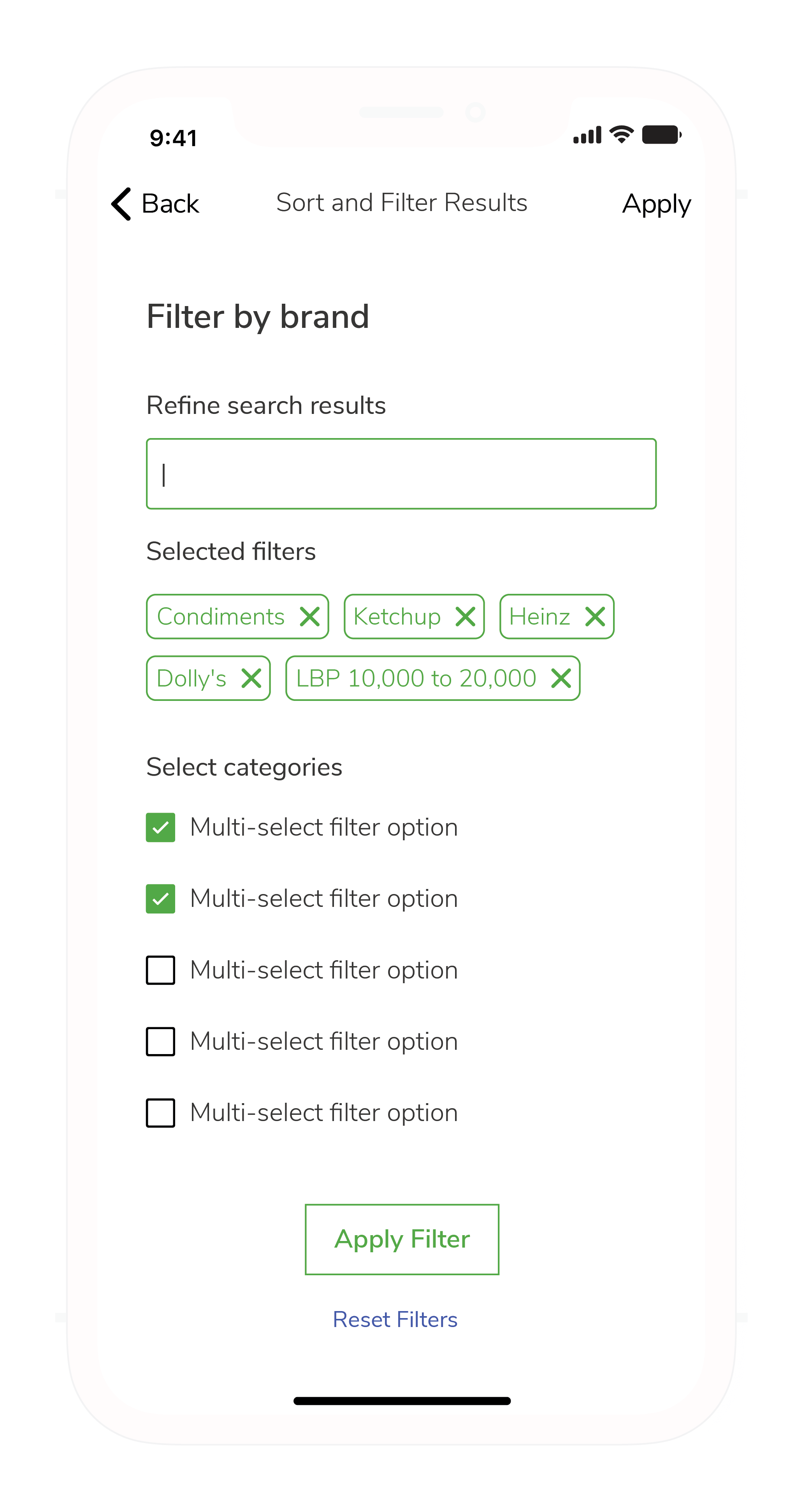
- Regional customization (e.g., hiding alcohol/pork based on demographics).
Preferences and Sensitivities
We implemented a system to categorize users. Users could toggle "halal" filters to exclude pork and alcohol. Default settings were determined by location-based demographics.
Information Architecture
Designed a clear and logical information architecture that made navigation intuitive and reduced cognitive load.

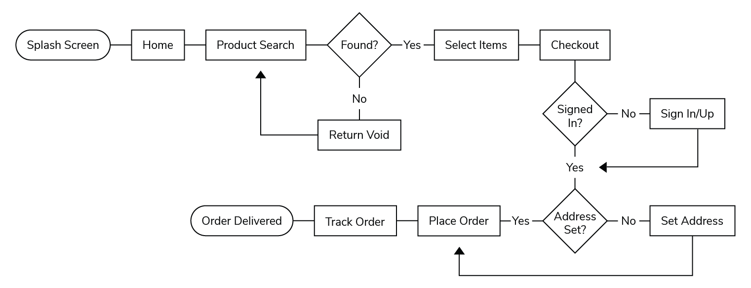
User Flows
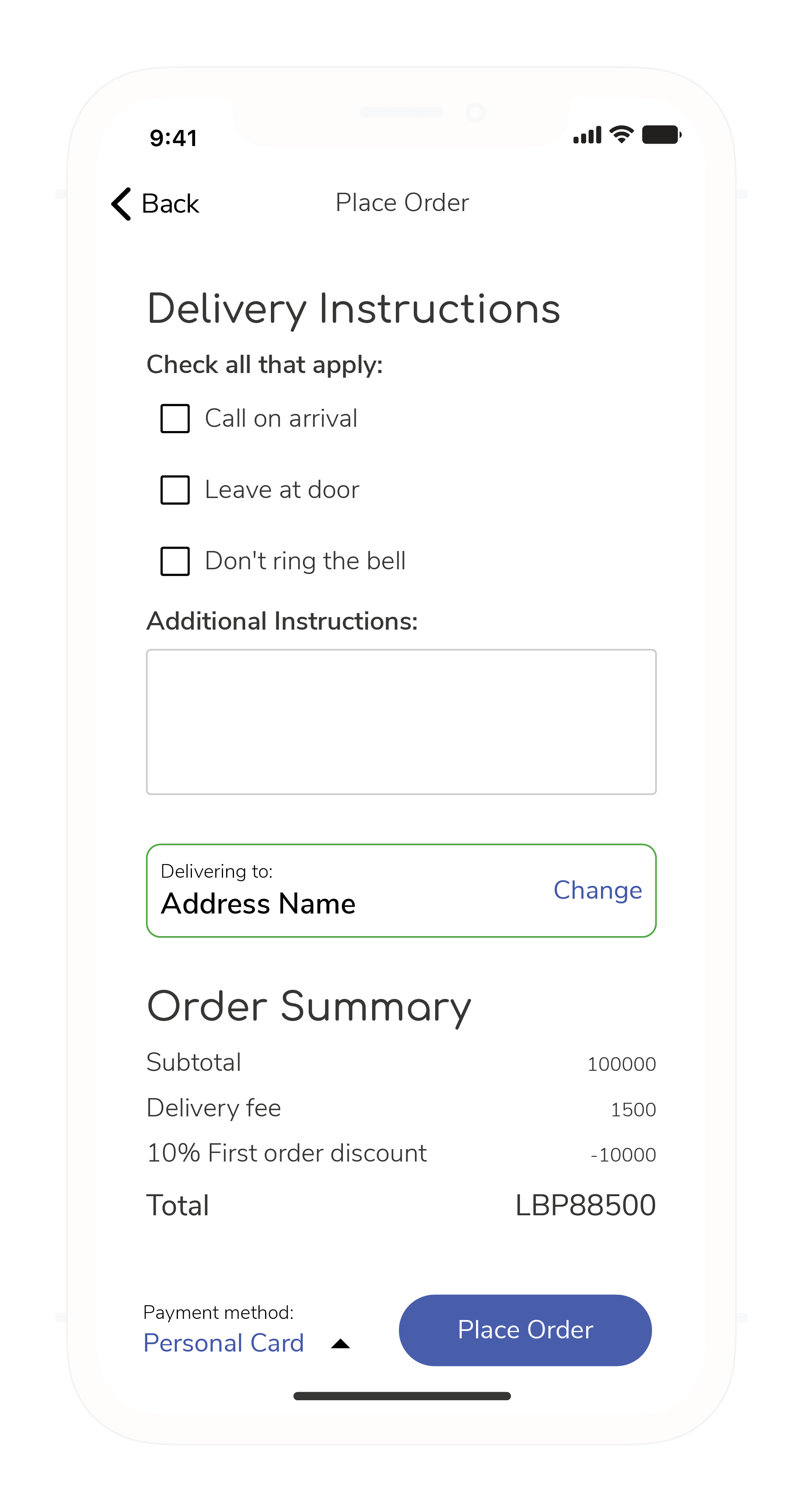
Created user flows to ensure the checkout process was clear and honest. Key touchpoints included personalized recommendations and transparent pricing.
Wireframing and Prototyping
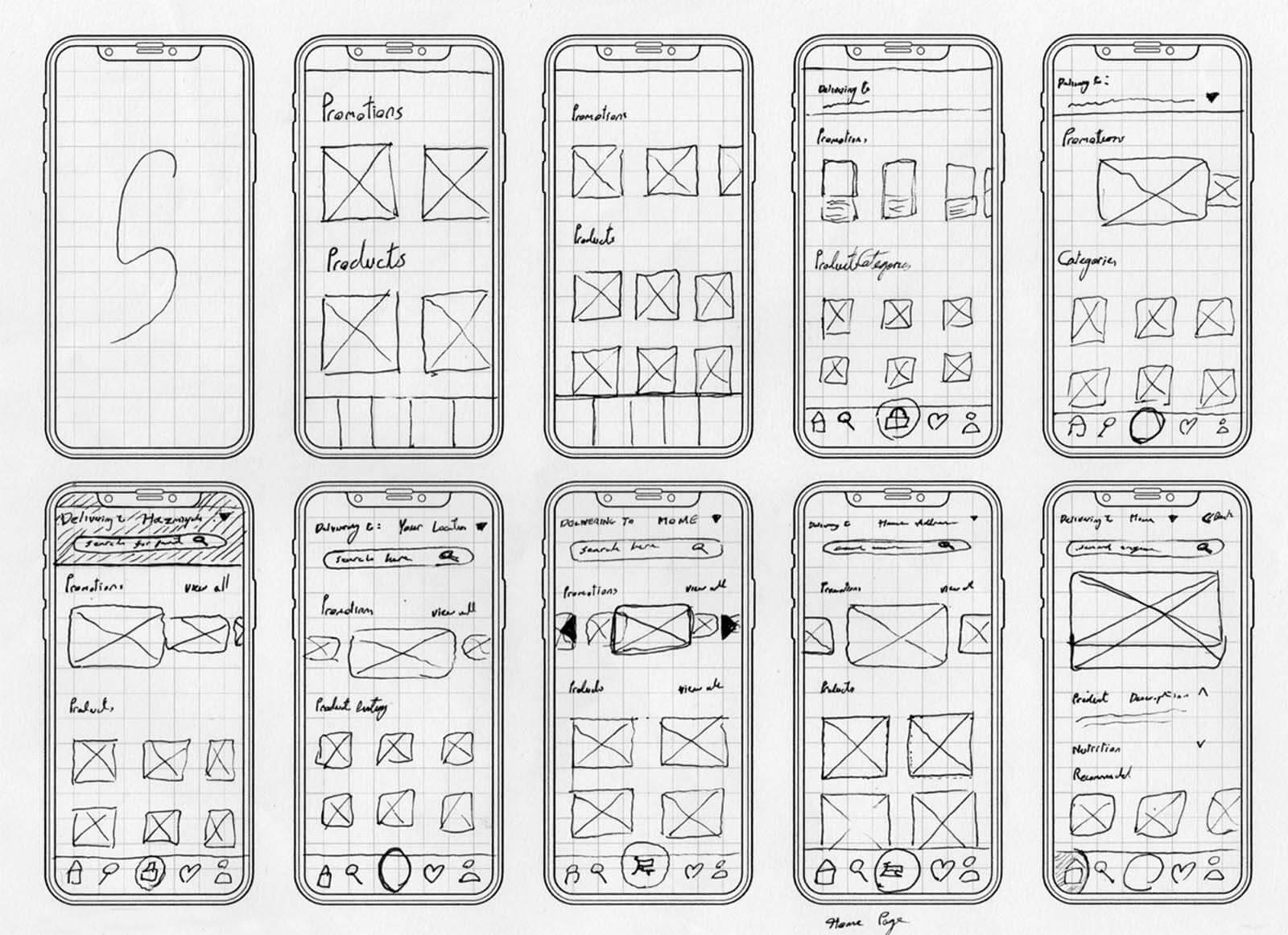
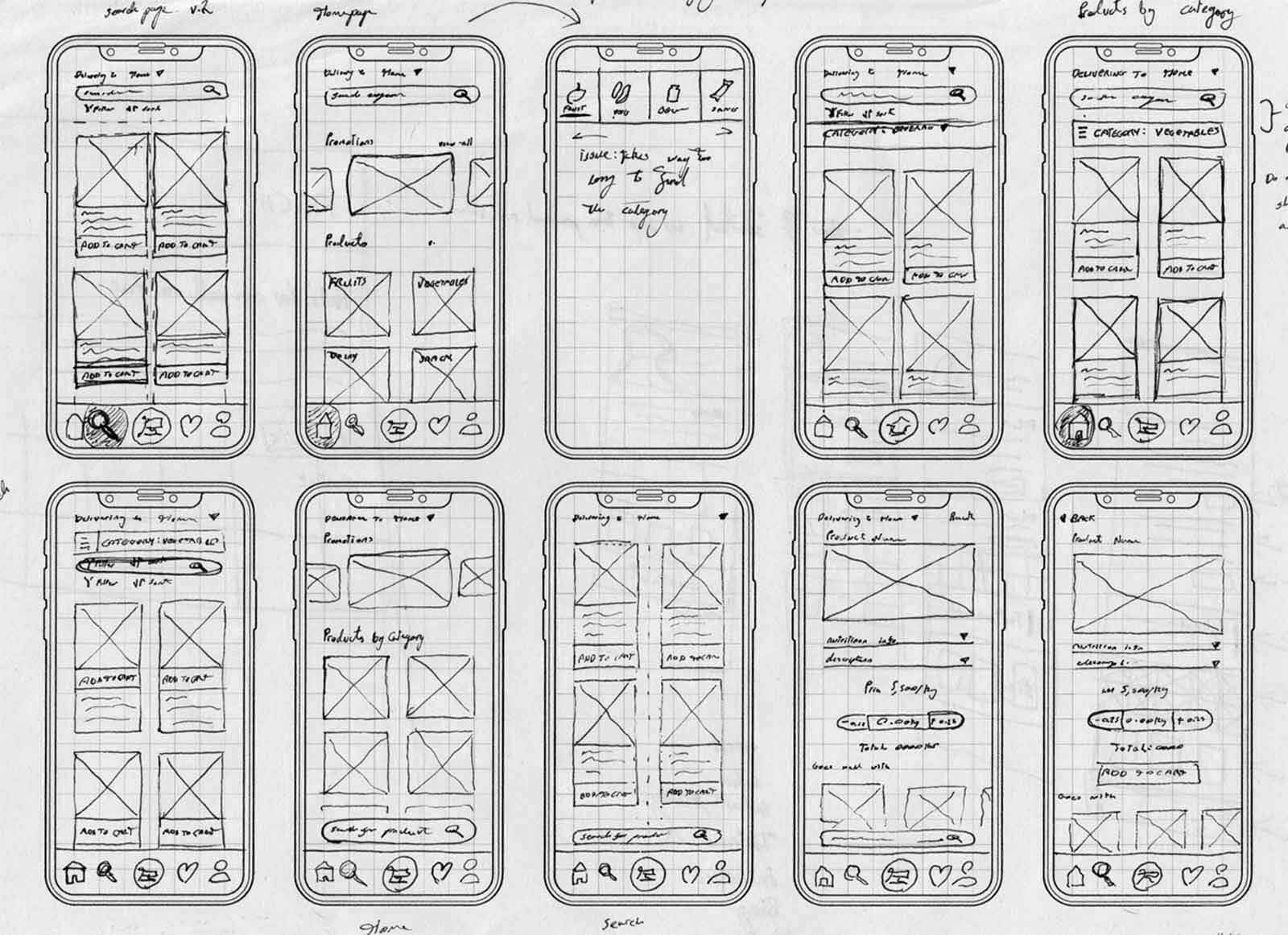
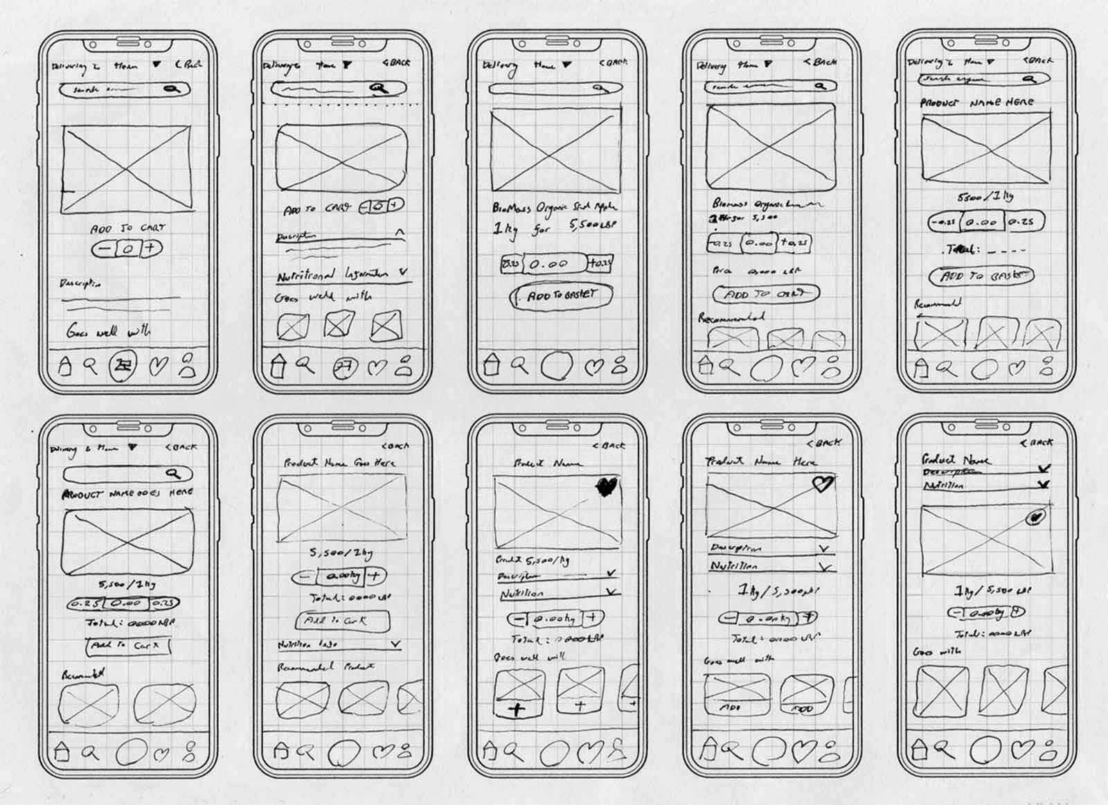
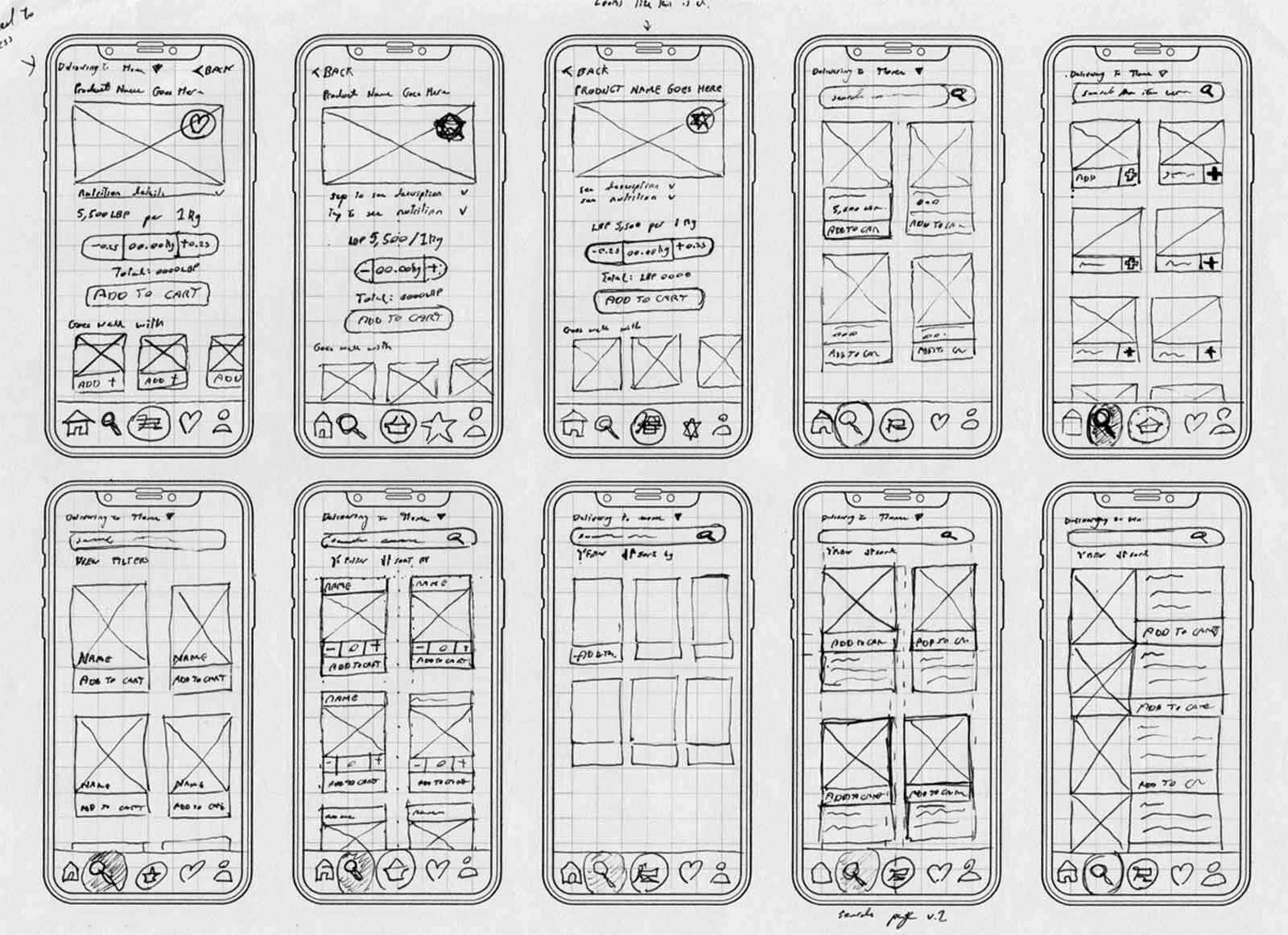
Began with low-fidelity wireframes based on user feedback, evolving into detailed prototypes for testing.
Accessibility as a Key Guide
I ensured the platform met WCAG standards, with clear typography and high-contrast colors, making the app inclusive for our target demographic of mothers aged 40+ with diverse tech exposure.
Registration Process
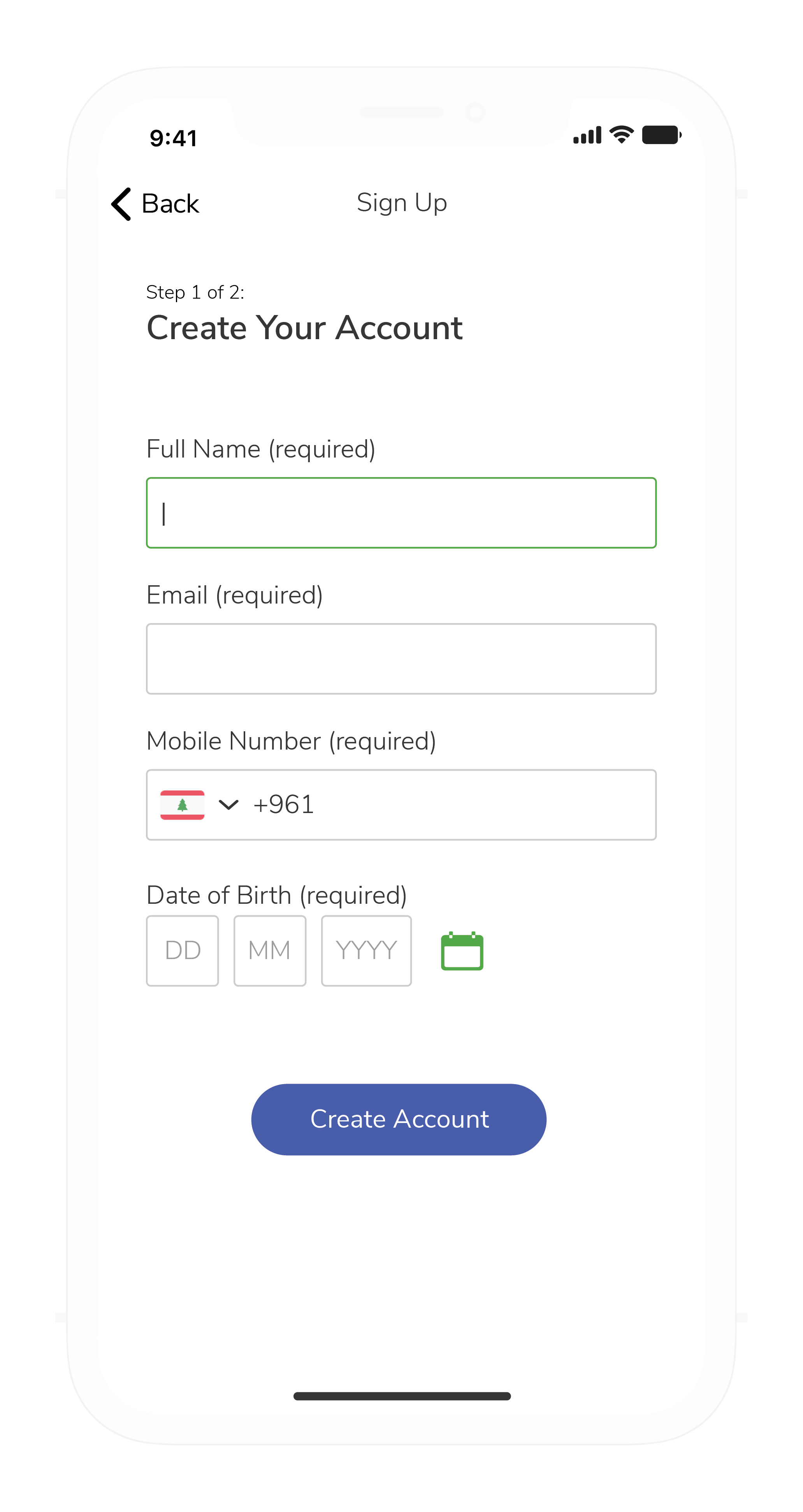
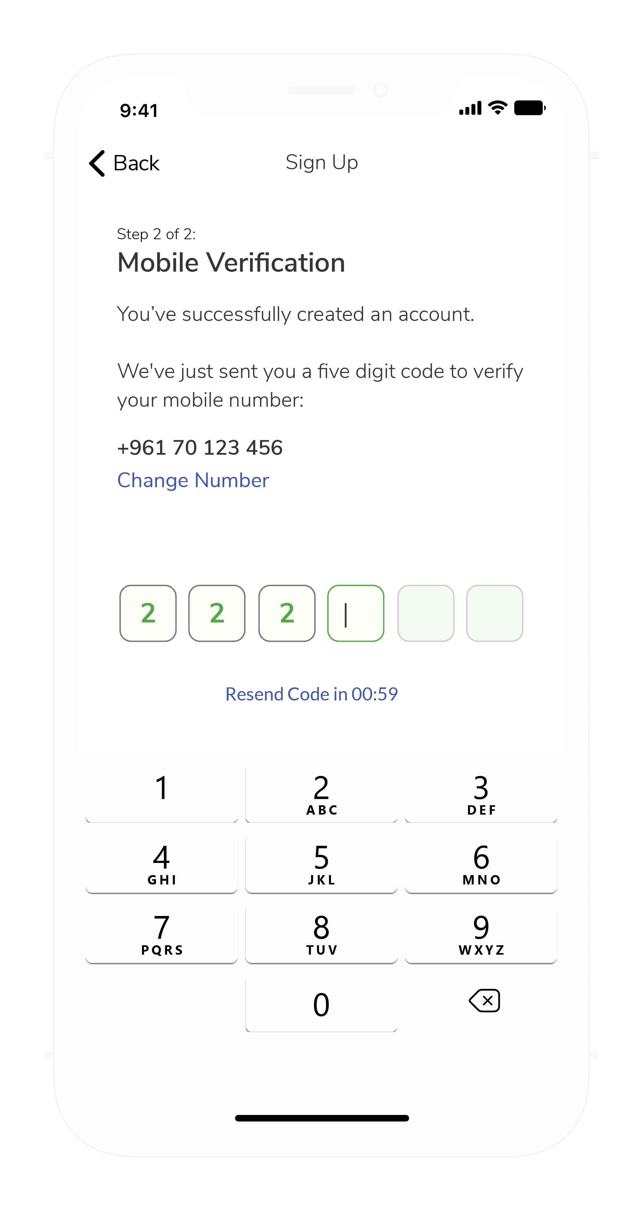
Designed a simple registration flow with OTP or social media options to reduce adoption barriers.
Registration Video
Home & Search
The homepage acts as a central hub with a prominent barcode search feature for quick item finding.
Home & Promo Video
Checkout Process
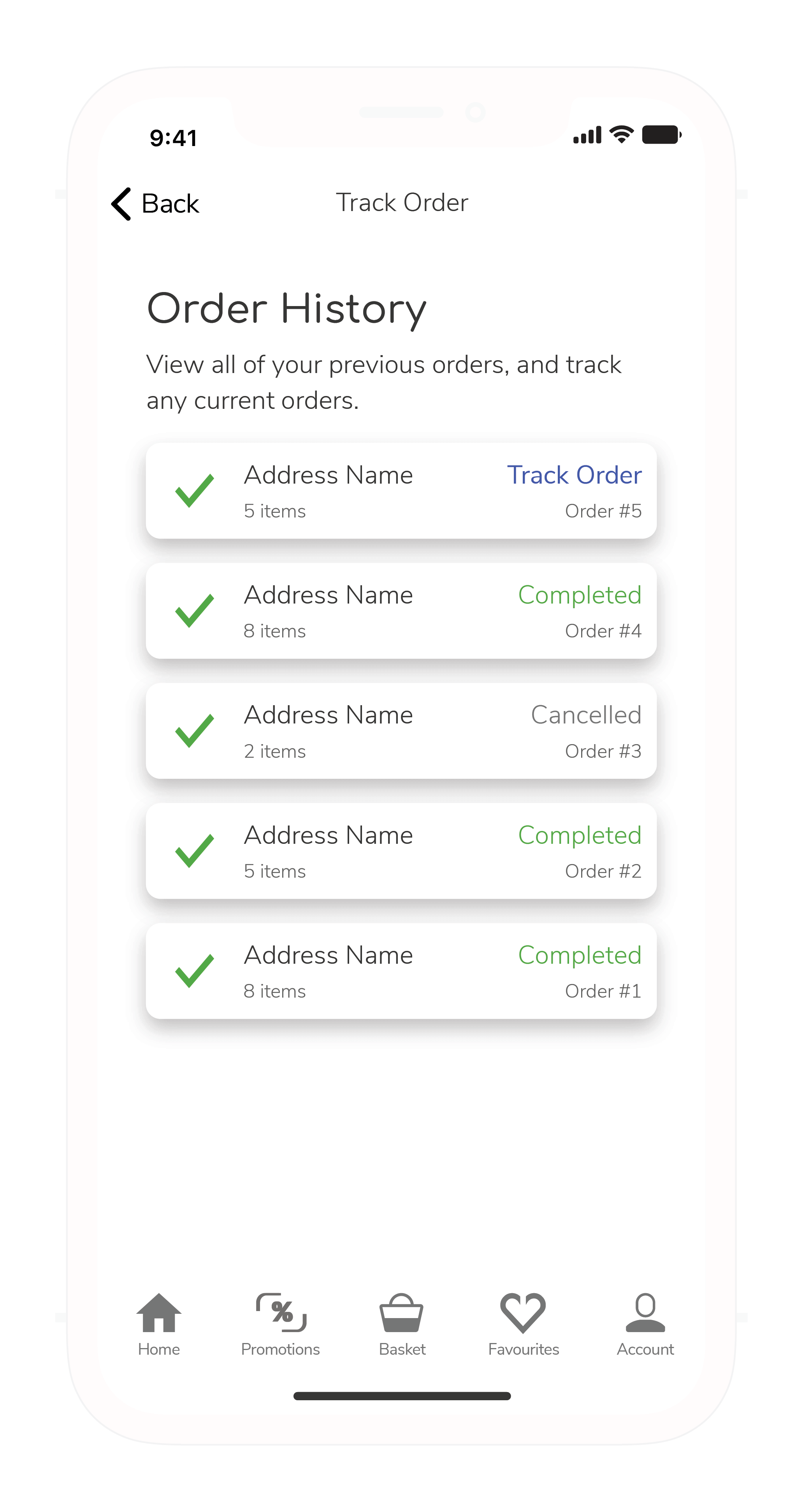
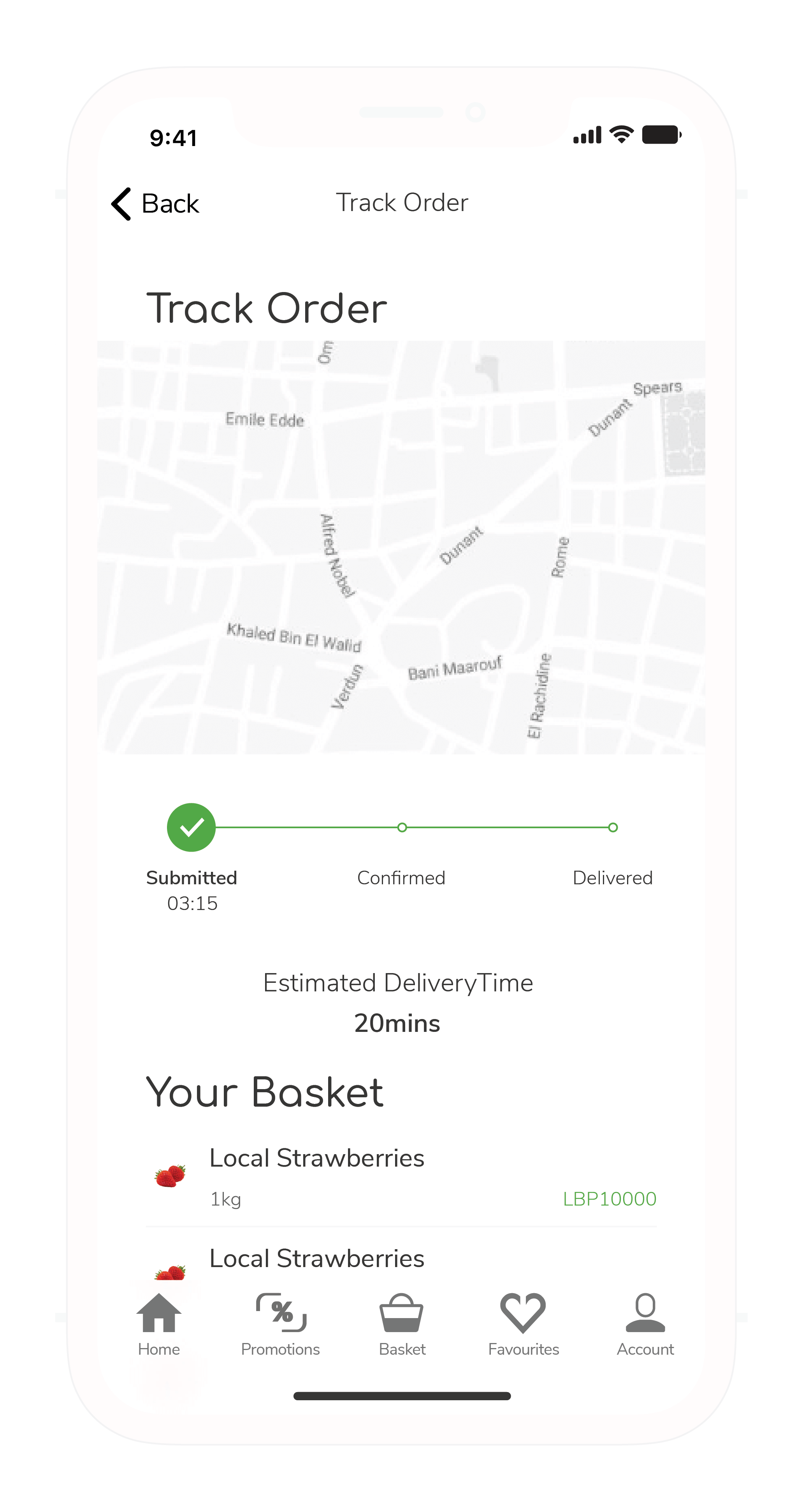
A transparent checkout process with clear delivery instructions and real-time tracking to boost user confidence.
Checkout Video
Looking for similar results?
Let's discuss how I can help you achieve your goals.
Let's move your product forward
Have a product, UX, or team challenge? Let's talk. I work with founders, product leads, and startups across Dubai and beyond to help solve tough problems and accelerate growth.
Use the form to get in touch. I typically reply within 1-2 business days. All messages are confidential.