Revamping a local NGO's website for better user engagement
Executive Summary
Outcomes
Reduction in steps
Faster navigation
WCAG Compliance
Role and Responsibility
- UX/UI design
- UX research
- Concept development
- Surveys
Project Scope
- Website redesign
- Competitive analysis
- User research
Business problem
The existing BETA website had poor user engagement and a confusing navigation structure that hindered conversions for pet adoptions.
User problem
Users struggled with finding adoption information due to overly complex navigation, long load times, and lack of crucial details like the shelter's physical address.
User Research
To ensure the project was necessary, I conducted surveys and interviews to understand the local attitude towards pet adoption in Lebanon. The results showed a significant need for a better platform.
Based on my research, key insights was that pet adoption platforms available in Lebanon suffer from:
- An inability to create quick conversions.
- A lack of vital information
- Overly structured navigation.
Surveys
I gathered data from potential adopters to identify key pain points and expectations when using the website by conducting a survey. The survey was designed to filter for and validate target users. Surveys revealed that millennials are the primary audience interested in adoption, with women showing more decisiveness.
I compiled key insights from the surveys into an easy-to-digest infographic. Key points include the demographic focus on millennials, the higher decisiveness towards adoption among women, and the need for better educational content. The survey revealed that the lack of knowledge about pet care and adoption processes was identified as a major barrier.
Interviews
Conducted in-depth interviews with stakeholders and potential adopters, and identified pain points in the current user journey, particularly the difficulty in navigating the site and finding key information.
Competitive Analysis
Analyzed a similar NGO, Animals Lebanon, to identify best practices and shortcomings in their user flow compared to BETA.
| Journey | B.E.T.A | Animals |
|---|---|---|
| Clicks | 4 | 4 |
| Accesibility | Easy | Medium |
| Time to Page | 18s | 35s |
| Route 1 Steps | 8 | 12-13 |
| Route 2 Steps | 9 | 8-9 |
| Call to Action | Landing | Page Bottom |
Personas
I developed two personas based on research findings:
Jad Khoury: A young professional who is interested in adopting but is concerned about his family's ability to care for a dog.Maya Sinno: An art director who lives alone and has previous experience with pets but is unsure about the adoption process.
Wireframes
I created wireframes that focused on reducing clutter and improving access to key pages, such as the adoption and contact pages.
News and Homepage
I redesigned the homepage to serve as a central hub, prioritizing quick access to critical information such as the adoption CTA and recent news updates. I also simplified the layout to ensure users can find essential links and updates at a glance.
Dashboard
I designed the user dashboard to allow easy management of user accounts and to track adoption status. This feature ensures that users can return to the site and pick up where they left off, or easily manage their adoption process post-submission. The dashboard includes sections for user profiles, adoption history, and ongoing processes, all presented in an intuitive, clean interface
Donation Process
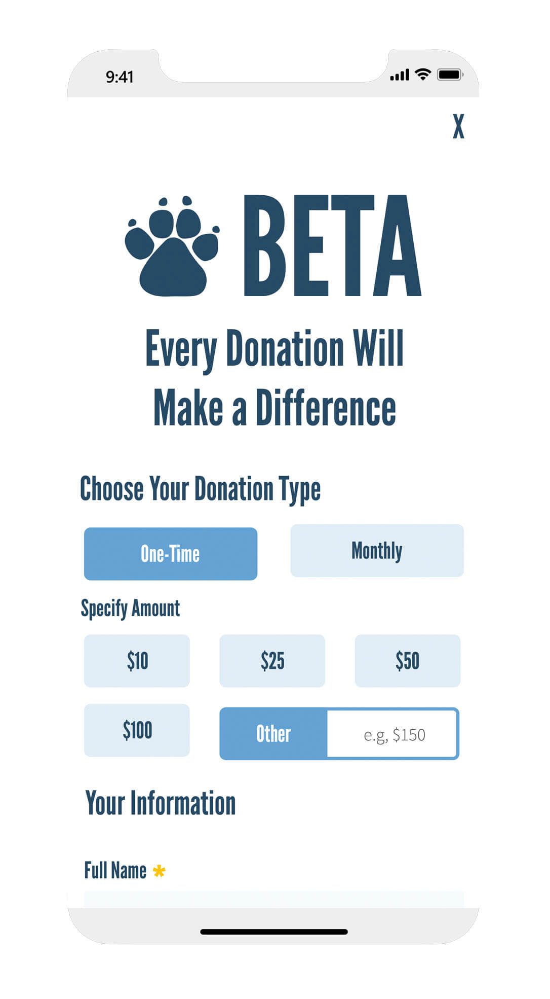
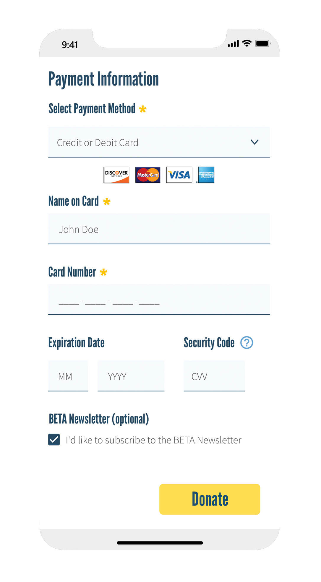
I made the donation button more prominent to make it easier for users to contribute, and drive more donations, which are critical for the NGO's funding.
Contact Page
I simplified the contact form to improve user interaction. The form is straightforward, ensuring users can easily get in touch with the shelter for inquiries or follow-ups regarding the adoption process. The redesigned contact form includes fewer fields and clear instructions, making it less daunting for users to complete.
Adoption Process
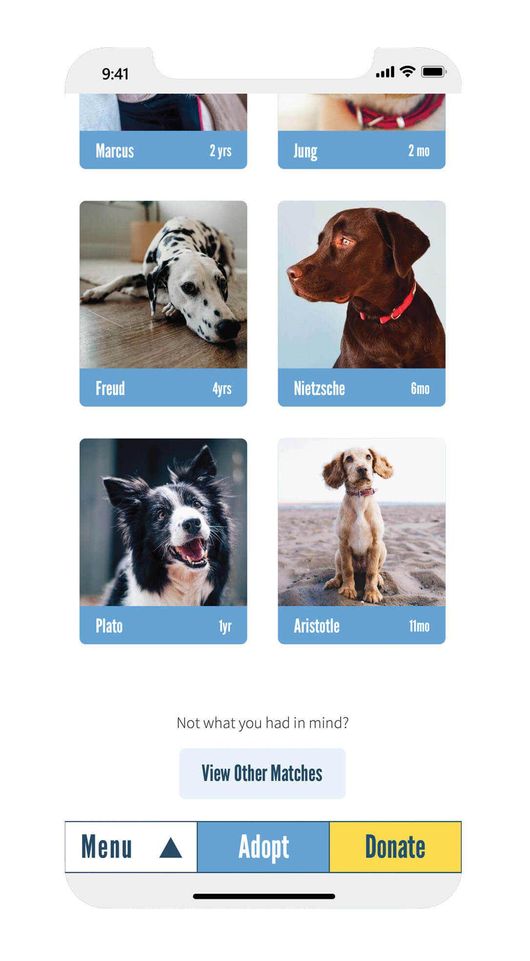
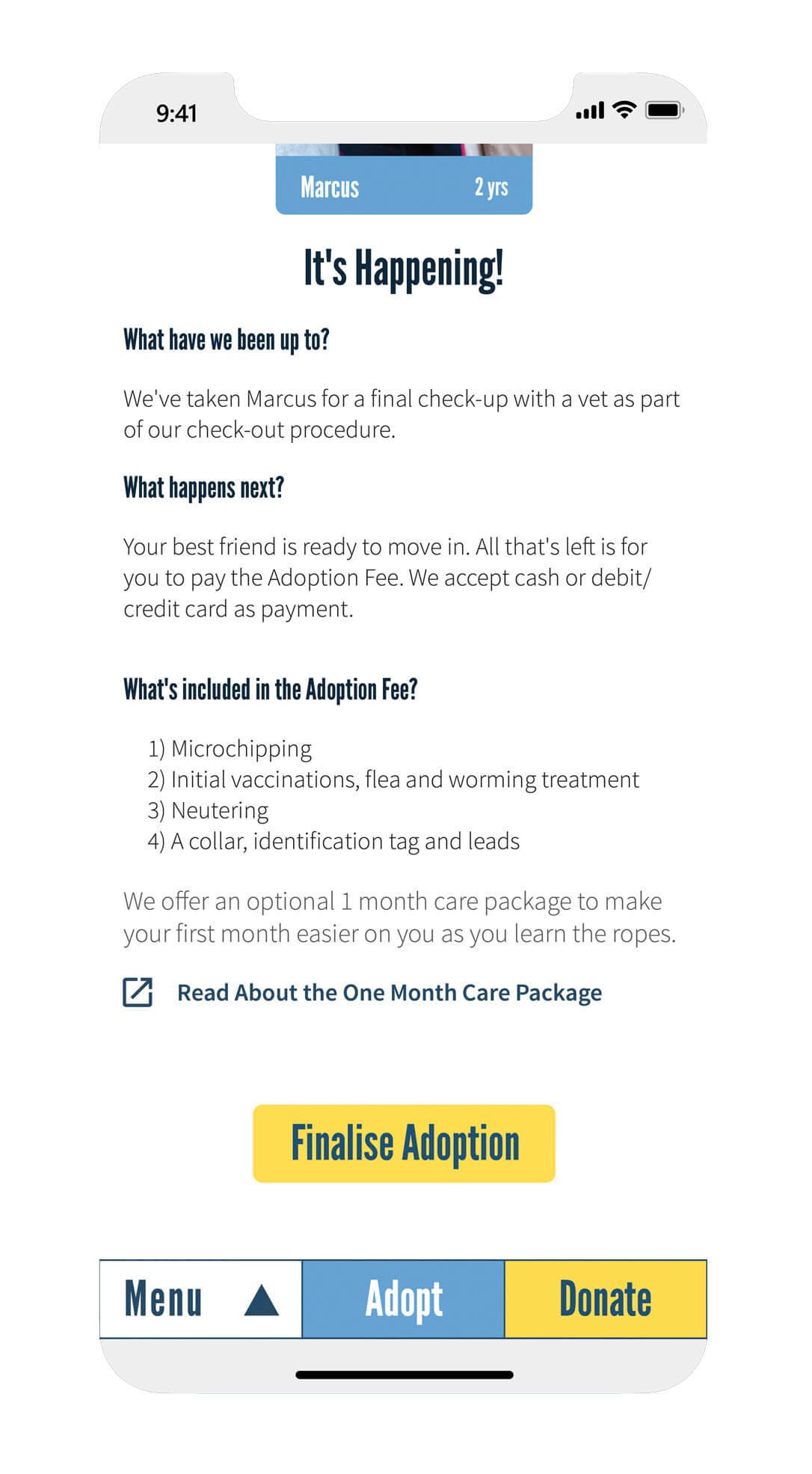
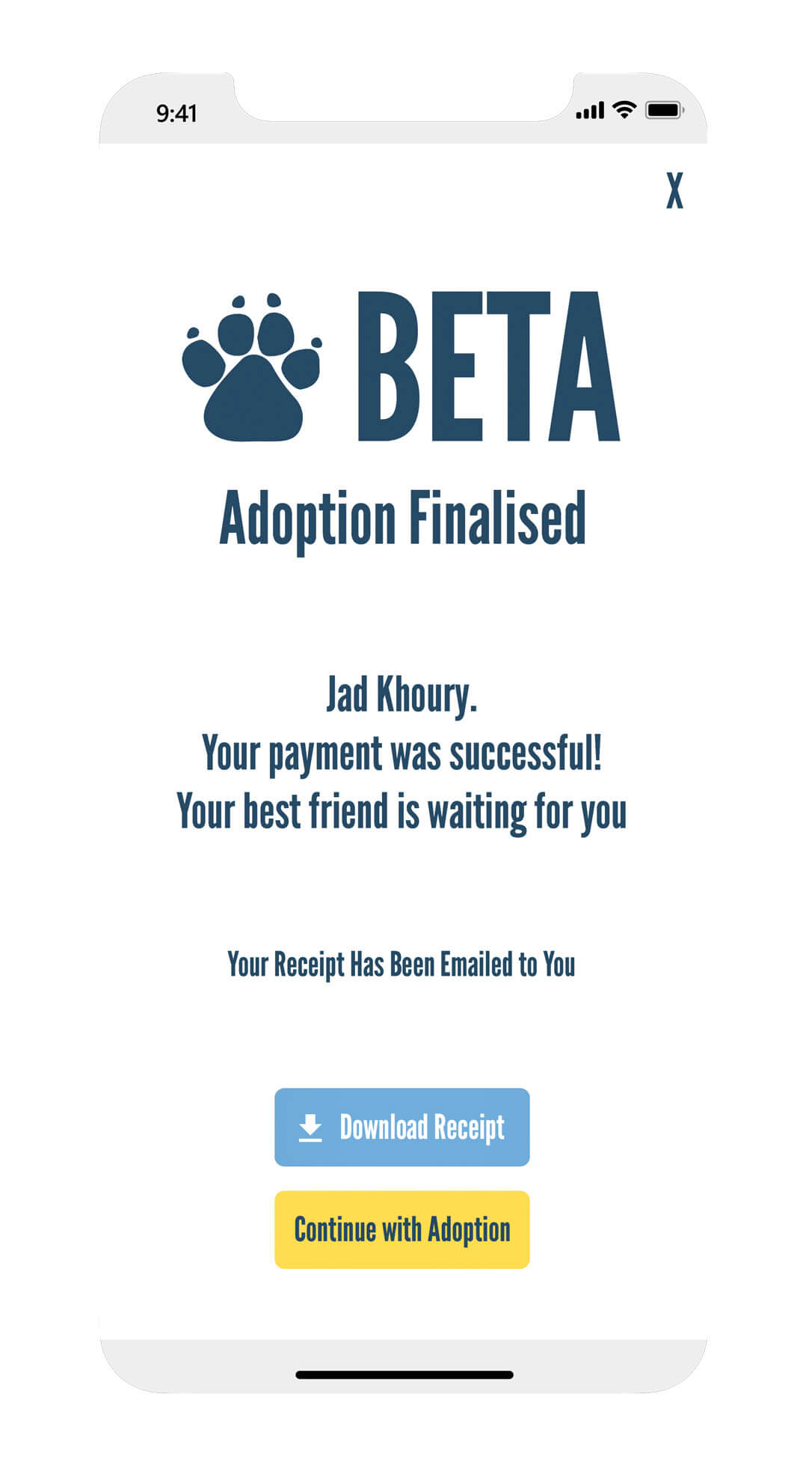
A key focus of the redesign was simplifying the adoption process to make it more accessible and user-friendly. I reduced the number of steps required to complete the adoption process by consolidating information and optimizing the user journey. I restructured the adoption process was restructured to be linear, guiding users from browsing available pets to completing adoption forms efficiently. Users are now provided with clear instructions and prompts at each stage, ensuring they understand what is required to complete the adoption. In addition, I added visual aids and progress indicators to help users track their progress through the adoption process, which should in theory reduce drop-off rates.
Looking for similar results?
Let's discuss how I can help you achieve your goals.
Let's make your goals a reality
Got a project, question, or opportunity in mind? Let's connect. Share a bit about yourself, and I'll get back to you within 1–2 business days. Whether it's about UX solutions, product strategy, or recruitment, I'm here to help
Your information is confidential - I will never share it with anyone.


