Suspended Experiences
Preface
When we create experiences we generally have a set expectation of how things will develop. Generally speaking, most everything we design will fit some sort of a cookie-cutter, at the very least in the very beginning stages. We have a set of rules to follow, for example with user experience design we've got the basic user heuristic analysis, and with architecture, we have basic rules of proportions to make a design look buildable.
What if we took these rules, and slowly picked away at them to create a suspension of disbelief?
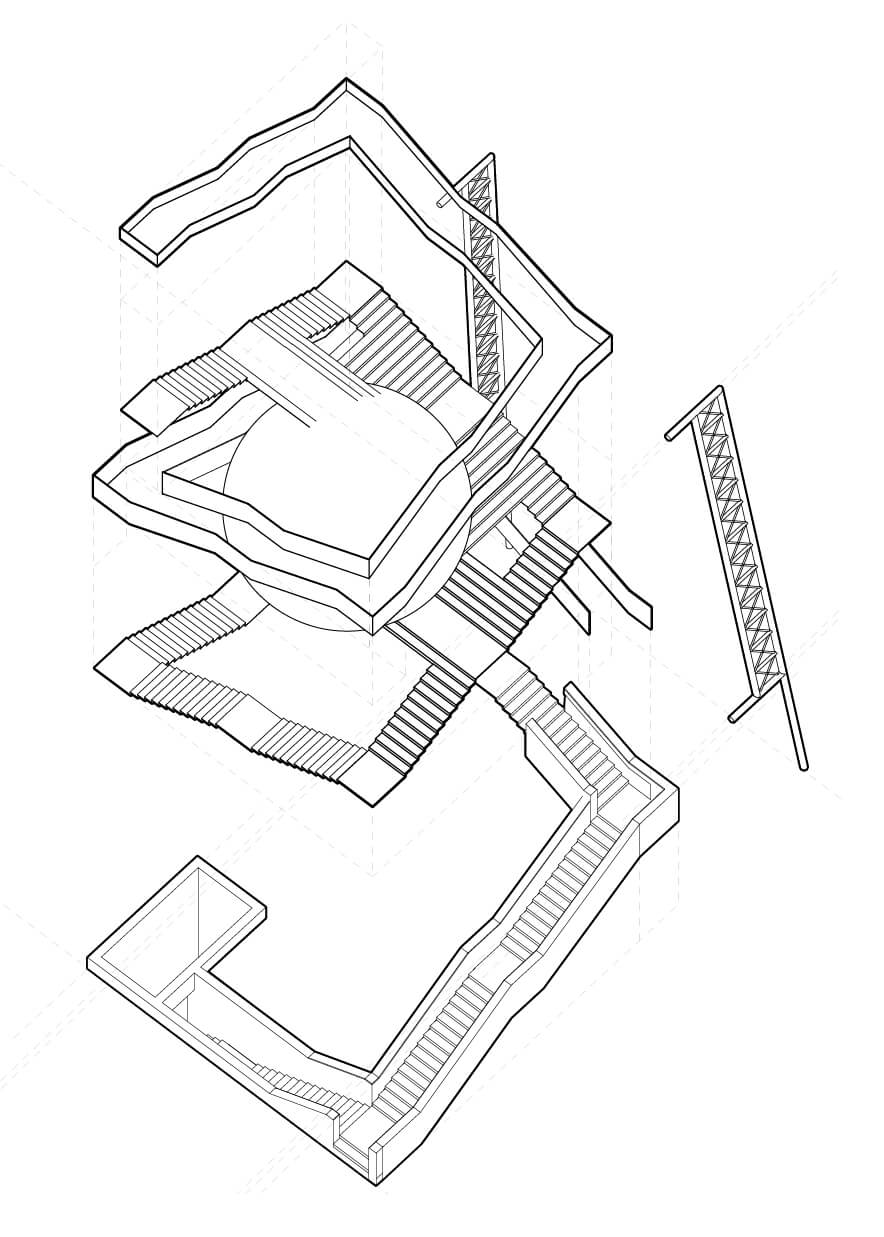
This project takes a water tower and slowly picks away at what makes a tower stand in a very precise manner to create an experience that looks plausible but remains within the realm of fantasy.
Perceiving Reality
Let's look at how a typical water tower with an observation deck might look like. When we see buildings we intuitively understand that we need columns on all four sides to hold it up together. What happens when we decide that we no longer want to be bound by the rule but at the same time make our intuition second guess itself?
Rebuilding Reality
After understanding the rules in which we want to operate with, we'll start moving away from the dream world and start to step back into reality. One of the biggest and most fitting inspiration for this type of project is Salvadore Dali's “The Burning Giraffe" where I borrowed the struts his giraffes are walking on to avoid the usage of strictly vertical elements.
Detailing Reality
Architectural
Plans
Elevations
Hand Renders
Understanding Experience
Now that we have the final product we can finally sit back and observe. The structure stands right between the line separating our world, and the dream world. Adding any more structural elements will solidify it in the real physical world, and taking away more elements will clearly label it as a figment of our imagination.
How does this relate to experience design?
As designers, we need to understand how the human mind works. We need to understand what elements we can take away, but more importantly, we must understand what we must keep to preserve legibility and readability. Think about the neumorphism based user interface. It's pretty to look at, perhaps not functional, but it's a sight to behold. We see buttons that appear like surfaces on the phone screen, almost as if they were just barely breaking the screen's surface. We need to however also step back and look at how we perceive our interfaces. You might be able to read the screen well, but someone with poor eyesight might not be able to do so. Your user experience is not necessarily your colleague's experience.
In other words: Just because we can do something, it doesn't mean that we should.
As humans, we inherently value beauty, but as designers, we need to understand and differentiate between aesthetic beauty, and functional beauty.
Be honest, would you climb up that water tower? I can't say I would.
Final Thoughts
This project, while highly metaphorical, held a very important lesson: Make sure to breakdown a project to its bare essentials, but also make sure that in doing so that your project does not lose it's perceived function.


